Trying to Excel at Excel
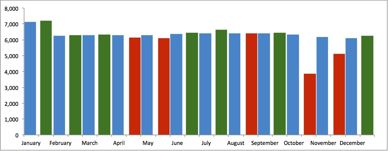
I am trying to create an Excel column chart that displays a ‘Target’ column and an ‘Actual’ column by month. I would like the ‘Target’ column to always show on the chart in blue and next to it (right) I would like to display the ‘Actual’ number in green (if equal to or greater) or Red (less than). I have been able to get all three bars on the chart, but the difficulty is how to show the blue-green, or blue-red columns side-by-side depending on the ‘Actual’ value.
In other words, the issue is that when the Actual data is equal to, or greater than the Target, I want only the Target (blue) and one of the two Actual (green or red) columns to show. As you can see, I can get all three, but not just the two I’m looking for. Also, there is too much space between the columns which are correct, i.e., January.
Any insight you can offer will be greatly appreciated.
The Excel file containing the data and the image can be found here.
I would suggest stacking the 2 actual fields, and separating the target field but making it wider. The visual effect, while not exactly the side by side that you wanted, is pretty similar.
If yu really want to go side by side then I would build 2 completely separate charts (one for target, one for actuals) and then overlay them (making the backgrounds transparent). This will achieve the exact visual effect, though it is kind of cheating.
Good luck with it.
Keith’s got the right idea with overlapping bars, but there’s no need to make two charts and try to keep them aligned. There is almost never any need for this.
You need three series:
Blue for target, Red for below target (zero if above), Green for above target (red if below).
Make a stacked column chart. Move the red and green series to the secondary axis. Make the gap width of the primary series (blue) small, like 50%, so the bars are wider, and make the gap width of the secondary series (red & green) larger, like 200, so the bars are narrower.
Here is an illustration.
Another option may be to offset the Good and Bad Values from the Target Values by one row, add another blank row below to give separation for the months and create a stacked column chart.
Set the series options to 100% Overlapped and Gap Width to ‘No Gap.’
Format Horizontal Axis -> Line Color to ‘No Line’.
Using Jon’s figures illustration below.
Hi guys!
The key to efficient Actual vs. Target analysis is to calculate the variances and then display those variances in red/green. So instead of coloring the whole Actual columns in red/green, try to display the Actual values in neutral color (preferably grey) and then put an additional series of variances on top of it in red/green.
Below I prepared 3 different solutions that work well for your example. As you can see, these solution impose significantly different perception of numbers. For example, in proposals from @HelpMeViz, @Keith, @Jon and @Les, the amount of red color in August is larger than the amount of red in October. This is wrong, because in August, the actual value is almost on the target, while in October it is significantly below the target.
If you display the variances correctly, the reader’s attention on red or green colored areas will always be proportional to the difference from the target. More variance – more attention, zero variance – zero attention.
I hope this helps. You can see more examples like this at http://www.zebra.bi
Best regards!
Andrej Lapajne
Les -
Thank you very much, this is exactly what I was looking for. What a difference an empty row can make!
A similar approach to the one used by Keith and Jon uses a scatter plot series with horizontal error bars to display the target values. It places a little more emphasis on the shape of the actuals and on flagging the months the target was missed, and a little less on the shape of the targets and the monthly variance.
Whether this approach is any better is open to debate; that kind of depends on what comparisons you find most useful for your purposes. I will recommend toning down the color, however. It’s tempting to use red and green because of their semantic overtones, but scaling it back and using color to flag exceptions can make for an easier viewing experience.
Now that you got an elegant solution from Jon Peltier, I can’t help but ask why you want to use this display. I’m not 100% sure what your data is, but it looks like a simple comparison of a time series. Perhaps it’s because you have discrete values, but, in case, I would be tempted to represent it in the simple line chart below.
When the actuals fall below or rise above the target, it is visually obvious. The line chart also integrates text and graph, avoiding the far away legend of your original display.
Most importantly, the real event in your data set seems to be the dramatic drop in October, followed by only a partial recovery in November. Your initial set up de-emphasizes this by using the bright red for everything that falls below the target, ever so slightly. It took me more time to see it on your original graph than in this line chart, where it dominates the visual, as should be (it seems).
John’s colors are also better. Use a subtly grey for your reference point, not an invading blue that draws attention to itself. I also prefer three-letter acronyms for months to display them bigger.
Hope this helps.
Two things would improve Francis’ chart.
1. Use markers to indicate the actual monthly values. Otherwise, the eye immediately goes from the low of October to the recovered value of December, without noticing the intermediate November value.
2. Use distinct markers for October and November actuals to indicate their great difference from the target. You can identify them easily using a third series with a formula like this:
=IF(C2/B2<0.9,C2,NA())
where B2 is the Jan target and C2 the Jan actual, and filled down through Dec. You can include data labels on these indicated points with the percent drop or some other quantity.
You could keep with the line chart, but use no lines or markers for the actuals, and instead use up-down bars to show variance from the target. The smaller bars don’t attract much attention, as they shouldn’t, but October and November shout at the viewer.
This might be my favorite of the options I’ve considered.
Hi Jon -
We like the final chart you posted. How can we create it?
Top left: line chart
Top right: add up-down bars
Middle left: format up-down bar colors
Middle right: Format Actual series to use not line, change Actual series gap width to 100
Bottom: add labels to the two largest bars
Thank you all so much for your input, evaluations and assortment of options. This chart is one of several components for a dashboard tracking Cycle Counting in our parts departments; a 90-day wall-to-wall Physical Inventory conducted daily – 4 times per year. When creating the dashboard, our first choice looked much like the column chart Keith provided. The colors didn’t work well together, so we then considered stacked columns (same issue), and finally settled upon the standard column chart provided. The color selections are not random. In our corporate reporting, blue represents targets, and/or baselines. Green and red then become obvious.
Hi Joe
I realise you are likely constrained by the corporate colour scheme. If this is so I would strongly recommend one of the charts that does not rely on a full-height bar of red/green to distinguish good/bad performance – too many people would simply not be able to tell the good/bad bars apart, aside from the difficulty in distinguishing actual performance.
I agree with Jon on his preference for the last chart shown (note that it is blue/orange rather than red/green). I think that alternatively Andre’s first chart would be a good choice (a bit busy for me) although I have also used overlapping bars (Jon’s first response) and target bars as shown by Jeff previously (target can be visually hard to locate in some data sets).
Enjoy your new-found options.
Matt