Percentages and Targets
This request for help comes from Mike Clark.
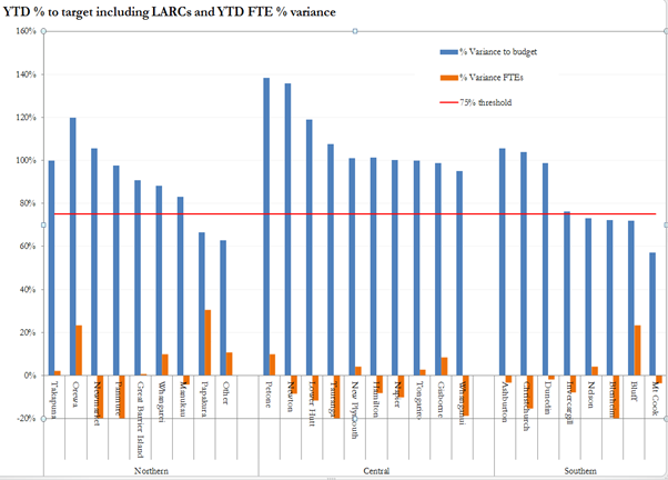
I am aiming to compare two categories (both in percentage), one of which can and does have negative values for particular locations, and then grouped into regions. There is also a 75% threshold that I would like to show – the 75% is relevant only for the blue category.
What I hope to show is the relationship between the blue (% variance to budget) and orange (% variance FTEs) categories. For example, when the % variance to budget values exceed the 75% threshold–which is good–is that because the %FTEs are positive percentages (i.e., they used more staff than budgeted)? Or does the % variance to budget exceed 75% (again, the good result) when fewer staff are budgeted (negative % FTE)? While the current graph has the two bars side by side is there a better way to show the relationship? Any other general observations would also be appreciated as I don’t know how to avoid having some location labels overlapping the negative bars.
The Excel file is available here.
A scatter plot seems natural for seeing the relationship of the two measures, but I’m not seeing any strong correlation.
Trying a categorical contingency analysis of Meets Threshold vs. Positive FTE also shows a weak correlation, with an overall p-value of 0.21.
Hi Xan, thanks for that. I will take your idea and look for correlation for each site individually based on monthly data as that could well be informative.
However this particular graph is a snapshot across all sites and I would like to be able to emphasis in some way that Newmarket’s 105% came at a cost of an extra 20% FTE whereas New Plymouth’s 101% was achieved without using all their budgeted FTE (4.2% to spare).
If you want to highlight who’s doing the most with the least, you may want to create some sort of score that captures the measure you want. Here’s an example using score = budget% / (fte%+100%). Bars are ordered by score within region and those with budget%<75% are gray.
Thanks Xan I’m very happy with your idea and will use it. I had toyed with the idea of some kind of calculated field but by itself it wouldn’t have meant much to management but this way they can still refer to the data as they always have until they get used to the new scoring system.
Fantastic. Thanks.