Tax Scatterplot
From Howard Chernick (Hunter College and the Graduate Center, CUNY), Cordelia Reimers (Hunter College, CUNY), and Jennifer Tennant (Ithaca College):
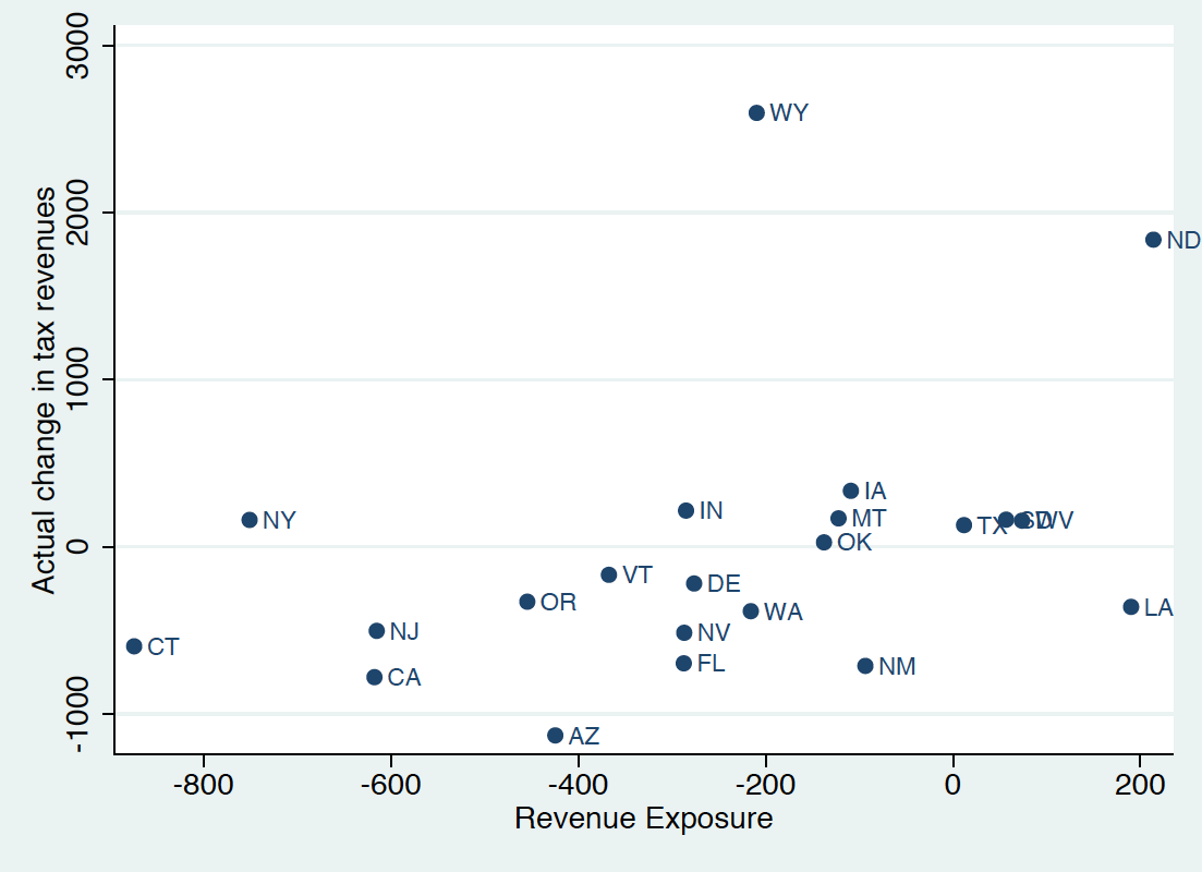
This is a scatter of the actual change in state tax revenue, 2007-2009, per number of federal returns, against a hypothetical measure that we call revenue exposure, which is defined as the weighted sum of the change in AGI by income slice times the 2007 effective tax burden on that income slice. We are trying to graphically show how tight is the relationship between actual tax change and exposure; states way off the regression line include a few mineral states (ND, WY), states that offset their tax exposure by raising their tax rates (NY), or states with a lot of tax exporting (tourism, etc), that took a big hit during the recession.
To focus on the graphical display, I think in this case it is important to be able to distinguish each point. Ordering the data is used to separate the values for each state and leaders help to highlight points off the regression line.
1. Sort data by revenue exposure – gives a reasonable simulation of the regression line.
2. Create a psuedo-scatterplot of both series against state names.
3. Calculate the difference between exposure and change (not a meaningful number), and apply the value as a custom error bar to revenue exposure to draw leader lines between points.
4. Format as you prefer.