Cost-Import Scatterplot
The following request comes from an economics book publisher. The existing figure is a scatterplot (originally constructed in Stata) with nearly 56,000 data points (csv file here). Ideally, the graph would follow the publisher’s basic style: Times New Roman font; no horizontal gridlines; and black-and-white printing. Because the publisher is constrained by their existing style guidelines, they don’t have a particular “problem” with the figure, but is interested to see what alternatives people might consider.
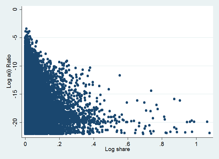
As for context, here is the abridged lead-in text to the Figure:
“To get a sense of the overall impact, Figure 1 plots the a(i) ratio [unit cost of product a of variety i] against its share in total imports within the sample for 2004. The most distorted goods tend to be a smaller share of imports. However, there are a number of goods that are relatively important with significant distortion.”
It seems like the field names are swapped in the data file vs the original scatter plot image. I used the field names in the data file, please let me know if I should swap these.
Also, there were 137 records where “Log a(i) ratio” was Null in the data file, I excluded these records.
For the binning of Log Share, the few records above -6 were rolled into the -6 to -7 bin, and the few records below -22 were rolled into the -21 to -22 bin.
The image here is the view I liked the most from the few charts I experimented with, you can see the others at http://public.tableausoftware.com/views/HelpMeVizCostImport/CutoffHeatmap
The heatmap really helps to show the density distribution and where it is centered, and the lookup table makes it easy to see get the relative numbers in each zone. One comment I would suggest is a posible visual cue to indicate the bin size: we see this listed as 0.005, and it’s not too difficult to figure out, but having a block next to the legend of the appropriate size could help readers to see right away. Otherwise, I think the heat map is a great improvement.
I could also suggest a few changes to make to the original scatter plot if you would prefer to go in this direction. Making the points smaller would help make the point better, and I think using transparency would also really help. Having semi-transparent points could recreate the effect of the density heat-map, where areas with more samples show up darker. The added benefit (if this is a benefit) is that each of the individual data points is still represented (which is lost in the heat map).