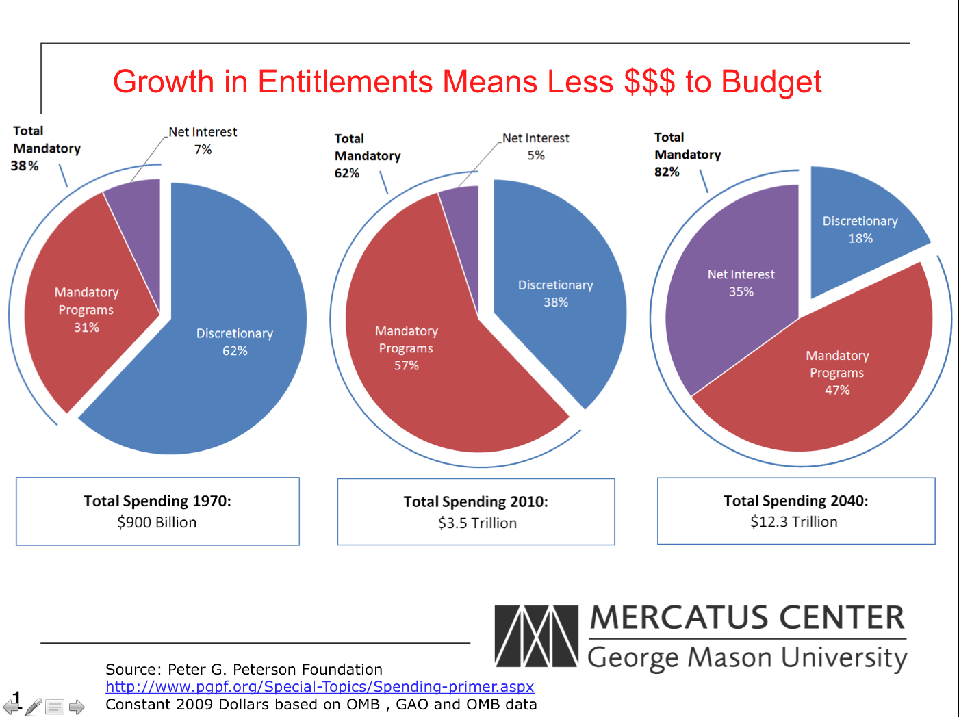
Budget Pie Chart Triplet
Jason Fichtner from the Mercatus Center at George Mason University sent in this set of pie charts.
“The basic story is that mandatory spending has been growing as an overall share of government spending. The dollar figures are in 2009 dollars. My point in the presentation is that mandatory spending is crowding out other priorities (education, infrastructure, etc.).
During one presentation, a person said that they didn’t see the point because all of the spending fit within the pie. Hence, to them, the visual didn’t (a) reflect how much larger overall spending was in 2012 versus 1970 since the pies are the same size; (b) the wedges are larger as a percentage but not relational to how much money is being spent; (c) it appears that everything is affordable because all of the spending remains inside the pie – there’s nothing to indicate we’re spending more money than we bring in via revenues, etc.
I’ve toyed with different presentations and have come up empty. How would you convey to an audience that not only is mandatory spending crowding out discretionary spending – but the dollars involved are much larger in magnitude?”
It’s a bit rough around the edges but something like the attached would seem to do both.
Same idea as Tim.
I was curious why they used 1970 as their start year, why not 1980, then they’d have +-30 years. I graphed from their data the percent of budget for 1972-2011, the current data sheet only goes back to 1972. The ghosted lines are the 1970, 2010 data they published in their charts. I also added the 2040 projections. And in the future numbers, the Net Interest payments are almost that linear, there is a little variation on the other 2 lines, but there is something in how they split the “Other” column between discretionary and mandatory I didn’t see.
The line/slope chart was my first thought as well. The downside of that approach is that it’s not immediately evident that the parts sum to 100%, which seems to be the thrust here. Tim’s approach of using dollars works if it’s evident to the audience that the parts already sum to 100%.
I tried 3 graphs. The first is a simple stacked column chart (excuse the lack of formatting), which is nice because the 100% aggregation is evident. Unfortunately, that approach makes it difficult to compare the specific categories across years; for example, the 57% to the 47% in mandatory spending is a bit hard to see, so I tried another approach where I broke it apart.
The third approach uses the dollar amounts as in Tim’s graph, but uses a stacked column chart. Here, I think, the visual focus switches to the aggregate amount and not the distribution, which I’m guessing is the main point of this slide.
Sorry, the other images didn’t load properly. I’ll put them in separate comments
And the other one.
Another variation on the bar chart using an idea I’ve used before on my blog…
This alternative allows you to visually compare:
Relative contributions of each component for a given year (compare blue parts reading down a column);
Component to total for year (comparing the length of blue area to complete rectangle);
Spending for each year (compare lengths of boxes in any row);
Spending for any component for each year (compare blue parts in any row).
The first two tasks are easier because they use an aligned scale. Things could be rotated 90 degrees (you’d end up with lots of whitespace to the left) to make the second two tasks easier instead.
For these three items, a Stacked Area chart could work well, especially with the sum of two of them being important as well. See http://eagereyes.org/blog/2012/embracing-uncertainty-two-line-charts for the inspiration.
This way we can easily see:
- Discretionary Programs decreasing each year
- Mandatory Programs increasing from 1970 to 2010, and then down for 2040
- Net Interest stable from 1970 to 2010, and then drastically increasing for 2040
- Total Mandatory increasing each year
I also added a horizontal stacked bar for comparing the actual values, for an additional perspective.
@Joe Mako: This is a nice one, Joe. Maybe combining it with the actual data over the 30-year period would be best, and then the bar chart below to highlight the three specific years.
You’ve got the challenge of wanting to show percentages AND absolute totals. A good graph for that is the spineplot (also called the Merrimekko chart). It’s a set of stacked bar charts, with the width indicating the absolute size.
Now you want to express the idea of two growing expenses “squeezing out” discretionary spending. We can do that by placing discretionary spending on the bottom of the stack, reinforcing the idea of something being crushed. We can reinforce this idea by using two shades of black for the crushing debt, and green for discretionary spending (the hero of this story).
Summarize the point in the graph title and you’re done.
A few errors in the first version – incorrect value for discretionary spending 2040 and no indication of percentages and dollar values. Now corrected.
> How would you convey to an audience that not only is mandatory spending crowding out discretionary spending – but the dollars involved are much larger in magnitude?
My first instinct here is, how important is the larger magnitude? You normalized dollar amounts for constant 2009 dollars — great, already ahead of a lot of visualizations.
However, even in constant 2009 dollars, is there a missing “global normalization”? The US budget went from $0.9T to $3.5T in 40 years, a 2.8x increase. However, the global GWP went from $12T to $41T during that same time period, a 2.4x increase (per wikipedia, in 1990 dollars).
So dollars involved are much larger in magnitude, but that’s true in the average global economy as well. I’m not an economist so forgive me if that’s not a common normalization, but my gut instinct is there’s not much of a story in “the dollars involved are much larger in magnitude”, because that’s true of the average country as well.
As for the share-of-the-budget, pie charts are terrible for making that kind of comparison. Stick with Jon’s three %-of-whole stacked columns. There is a story in the makeup of the budget, and pie charts do not get that across.
Honestly, I think what you have is pretty good, but a little cleaning up could really help bring out that main point: that mandatory spending will eclipse everything in the future. People get pie charts really quickly and I wouldn’t discard advantage so soon.
1. Keep the mandatory start point fixed (so it looks like mandatory is *growing* rather than wobbling everywhere. It’s pacman. It’s going to consume discretionary. ).
2. Make the discretionary part an even more muted color (try grey).
3. The interest should be a part of mandatory — it’s an interesting data point, but it’s not a separate category (purple). If you really need it to be part of the graphic (and I think it should be) try very light labeling and a divider (so it kinda looks like it’s own slice for those who are studying the chart rather than glancing at it).
4. Time. You’re doing a small multiples comparison (three pie charts over a time series). Make the years text bigger.
5. Also call out that the 2040 is a projection based on _____ — it hasn’t happened yet.
6. Consistent units. Don’t switch from billions to trillions.