Excel: Multiple Lines Across X-Axis Categories
Lars Verspohl (@lverspohl) writes in:
I’ve got an issue that might have a hopefully simple solution, but if so, I can’t see it and couldn’t find an answer to it.
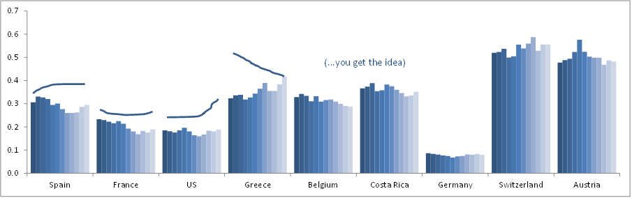
I have bar charts showing a time-series per x-axis category (across 12 weeks).
I would now like to show a second set of data organised in the same way (time-series across 12 weeks showing per x-axis category), however as a line-graph.
I’m not sure this is possible in the same chart, and I’m happy with this being in a second chart that I can overlay. Still, as I’m unsure as to how to go about this I guess my question is:
How do I organise a line-chart within each x-axis category? I appreciate that D3 can solve this elegantly, but unfortunately this needs to be in Excel for now.
Any other suggestions for better ways to visualize the data are certainly welcome.
I think what you would like to do is possible in Excel. But why a bar chart for one variable over time and a line for another over time? Wouldn’t it be better to use 2 lines per country? And with an extended Y-axis, you could plot all lines above each other, which is much better for making comparisons between countries and variables.
It also depends on what you want to show. If you want to show some kind of relation between the two variables, I think you should go for 9 small multiple scatterplots.
On a side note: is this from an Excel template or from some Excel default? I came across a very similar graph in a Belgian newspaper some time ago and made a redesign of it (although my redesign would look a lot different if I would remake it now :-): http://maartenlambrechts.drupalgardens.com/content/alles-kan-beter-autoverkoop-europa
This isn’t too hard if you don’t mind the individual lines living off of the original bar chart.
You can create sparklines for each of the categories (countries) you have here and use them for your individual line charts for the data you want to represent. I’ve included a screenshot here to show you what I was able to quickly mockup.
To make sparklines
– highlight the data you want to visualize
– click the charts tabs
– choose “insert sparklines” and make sure to selet the lines option
– it will ask you where to place the sparklines
– choose nine cells on the same row (I used a row above the graph for my example)
– edit the look of your lines.
I’m with Maarten: Discard the bars and use two sets of lines.
I was going to describe how I would do this, but it would be too long for a comment. Instead I’ll use this as the topic for a new tutorial on my blog (http://peltiertech.com/WordPress/). It should be up Monday. I’ll post back with the link.
Many thanks for your comments on this !
@Marteen and Jon: The bar variable represents actual figures, the line variable less important forecast figures. My thought was to present the actuals in a visually more dominant way. In addition, the latest figure is the most important one, which I can then also encode with the highest saturation (the saturation would need to be as in the chart you showed, Marteen). Oh and the similarity to your chart is eery, but coincidental…
@Ernesto: that’s a great idea and would work well ! My only problem is that this chart will probably have to link into a pivot table (I should have clarified – apologies). Hence, the parallel alignment of sparklines and bar chart will disconnect when the user picks a different number of countries. Also, ideally the 2 charts would share the same scale.
@Jon: very honoured re your post! eagerly awaiting it …
Many thanks again !! Lars
Here you go
http://ow.ly/d/1Qlr
Basically, I create two charts and overlayed one on top of the other
The line chart is a single series, with a gap between each group
The line chart has transparent background, plot area and the axes have been removed.
It’s a kludge, but I think its the best way to do it.
Another way
http://ow.ly/d/1Qly
this method keeps the data on single chart – this might be important – but not as visually the same
– add the data series for the ‘line’ as a group colum chart
– add a ‘plus’ error bar with fixed value of 0 & format colour
– set data series as ‘no fill’
Hope this helps
I should have clearer
– add the data series for the ‘line’ as a group colum chart ON A SECONDARY AXIS
Thanks _garilla – very good indeed ! Should’ve thought of option 1 really. Option 2 is even more elegant and will be very easy to implement in terms of data structure. Much obliged // +10
Lars –
I’m adding to my tutorial to show how to add the lines to a column chart. It’s easier than the two-chart approach you settled on. At least I find it easier, because there’s no need to make sure the axes on the top chart are aligned with those in the bottom chart.
My personal preference if I am showing forecast and actual values is to show the forecast as the columns, and the actuals as the line. I use the same light shade for all of the forecast columns so they are less emphasized than the actuals, and I use a dark line for the actuals so they dominate the forecast values.
Thanks Jon ! Very valuable input re actuals v forecast design and probably best for me to sit tight and wait for the tutorial …
thanks again everyone
I’ve published my blog tutorial, Multiple Line Charts by Category.
Have read and implemented it ! Excel greatness .
thanks again to you Jon and everyone who commented for your help…. very much appreciated
I understand you want the actual values to be highlighted, and specifically the most recent actual value. I think this can be accomplished with both measures being a line, with the actual colored by the difference from the forecast, the forecast line in gray so it is subdued, and last actual value for each country marked with a big circle. I also added a sort by average actual value.
Joe, that chart looks amazing! What tools or platform did you use to make it? It looks too good for Excel…
This was made in Tableau, and you can download the workbook and see how this view was made from http://public.tableausoftware.com/views/HelpMeViz/MultipleLinesAcrossX-AxisCategories
You can get Tableau Public for free from http://www.tableausoftware.com/public/download
Polywogs!
That’s really cool, it deemphasizes the forecast, highlights that last point (the head of the polywog), and provides +/- information by color.
There is a surprisingly simple solution for this. Start by creating a bar chart with both data sets along the x axis. With your mouse, select the bars belonging to the second data set. Then go to “edit chart type” and select line chart. This will change the second data set into a line on top of the bars belonging to the first data set.
We created a step-by-step guide based on the original data table, using formulas and a simple method to create the line-line or line-column version of the chart.
You can find it on the link below, with reference to this discussion and the tutorial by Jon Peltier:
https://sites.google.com/site/e90e50fx/home/multiple-lines-chart-step-by-step-guide
Cheers,
Kris
and The FrankensTeam
Pretty section of content. I simply stumbled upon your weblog and in accession capital to assert that I
get in fact enjoyed account your weblog posts.
Anyway I will be subscribing to your augment or even I achievement you access consistently fast.