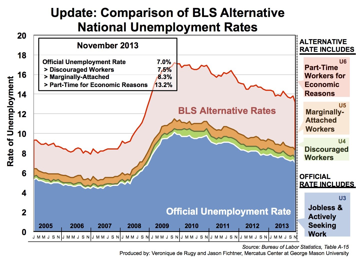
Unemployment Rate Area Chart
Jason Fichtner from the Mercatus Center at George Mason University sent in this stacked area chart (Excel file here).
“This chart provides a comparison of the different measurements of the unemployment rate from the Bureau of Labor Statistics (BLS). It includes new data on the official and alternative unemployment measurements for the 2012 and 2013. Data from the BLS is used to assess labor market conditions from several perspectives.
The most commonly reported unemployment rate – 7.0% in November 2013 – includes the number of people without jobs who are available to work and are actively seeking work in the four weeks preceding the survey as a percentage of the labor force (the sum of employed and unemployed persons in the economy). While this official unemployment rate remains the primary measure of labor market performance, there are reasons to believe that it is not the most realistic representation of the current state of the economy.
The limited picture that the official unemployment rate paints is readily apparent when compared to alternative measures of unemployment. The chart displays the official unemployment rate, or U3 unemployment rate, alongside various alternative measures from 2005 to the most recent data in November 2013. These alternative measures provide more holistic depictions of the general state of the labor market.
I think the chart displays an accurate description of what is going on. However, is there a better way to visually present this data so that it’s more eye-catching and/or more informative?”
I have 3 comments, first visually, make the areas a bit transparent, so the grid lines are visable, its difficult to make any assessment of values other than U6, or just use lines, not area.
Second, all 4 lines seem to follow the same pattern, what does it look like if the rate of change in shown?
Just from Jan 2005 to Dec 2013 they look like.
U6 – 42%
U5 – 28%
U4 – 30%
U3 – 27%
Maybe just show U6 and U3 numbers.
3rd, this is data about people, it would have more impact if you could show the number instead of or in addition to the percentage, so the reader is still connecting the data to human beings.
Here it a line chart version with millions of people and percent change.
The percent change is different from what I could figure out from the original, this goes to the clarity.
To better use the comment space.
Hi, Jason.
You’ve chosen a good graph for the message you’re trying to convey. You could use a line graph for this but I think that’s a better choice when you want to plot each category separately (i.e., you were more interested in comparing the trends and quantities of the categories than in showing the cumulative effect). There’s no wrong answer; there may be useful insights from either view. I have an example of each that I will attach.
With area graphs, when the different areas represent ranges of a quantitative variable, I like to use different shades of a single color to reinforce this. This is not true in this case–the different strata are categories of unemployment, not degrees of unemployment–but it’s not hard to interpret the categories on a continuum from most to least severe, and I think this treatment reinforces that interpretation. In this view, in other words, we’re probably less interested in adding together the rate of discouraged and part-time workers and omitting the other two. What we want is to see how the rate changes as you start from the official rate and then expand our definition to include the other categories.
The rest of what I did was just cleanup and editing. There were a lot of visual elements that could be removed or made subtler without sacrificing meaning. These include the borders on the areas and around the outside of the cart, the months in the legend, and the grid lines, which tend to focus the attention on questions like “in what month did the rate hit 10%” instead of the bigger picture. I also moved the annotations on to the data to reduce cross-referencing and to expand the area available for the graphic.
Hope this helps.
Jeff
And here’s the line graph.
My apologies for not responding sooner. Thank you all for the very helpful comments. I’ve been circulating your suggestions around the office for internal comments. We’re definitely going to incorporate some of your suggestions into our next version. I’ll post what we end up doing once we nail it down!
-jason