Part-to-Whole Help
Reader and contributor Ulrik Willemoes writes in the following request for Excel help.
I am looking for some feedback on a rather basic visualization. I wish to display a parts-to-whole relationship over time. I know stacked bars or areas do not work because of the jiggered baselines, so what are the alternatives? I am doing the visualization in Excel, but I think the general discussion of what would be good practice in this case would be interesting, no matter what tool you use.
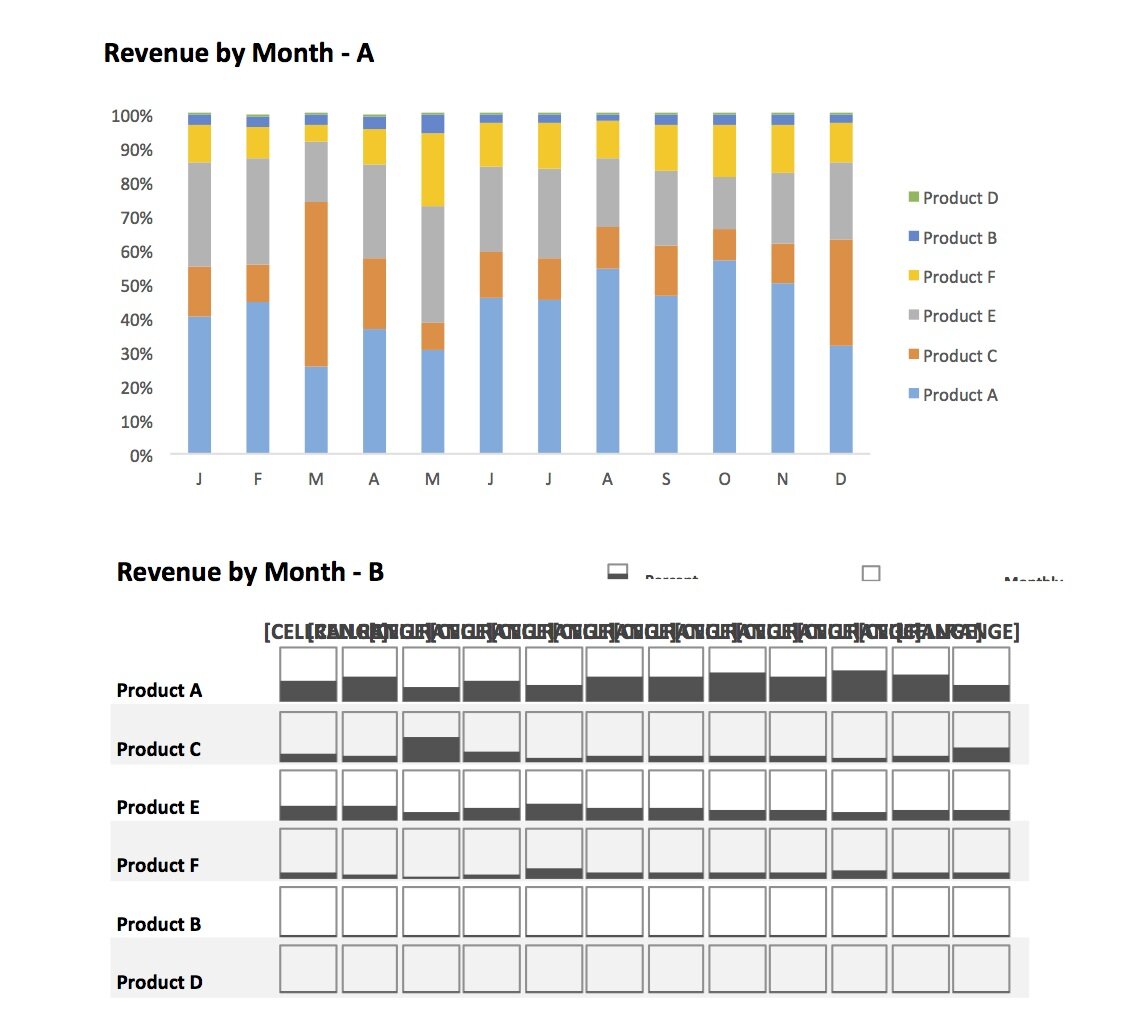
The Excel workbook contains a a sample dataset and my three takes on a solution. I have already dismissed Solution A, but could Solutions B or C be useful? What other alternatives might there be?
Thanks for any feedback/thoughts!
PS: I know you’re not supposed to connect categorical data like in solution C, but I think the line does give a sense of the distribution of the categories that is otherwise is missing…
The B version I think does this pretty well. Make each product a vertical bar chart by month and stack them vertically like you have them. Maybe add a common reference line across all of them, at say 25%.
How about a simple line chart?
This way you can see the trends and make useful comparisons, like seeing the two spikes in Product C (the one in March at the expense of A and E, and the one in Dec drawing mainly from A) , and how the pairing of Product A and E changed from tracking to divergent.
Additional context could be gained by adding another chart plotting the actual values for each Product and the overall total by month.
I would agree with the line chart, however display as small multiples as proposed by Edward Tufte. This could be done with all the data in each chart and a single series highlighted or as a stacked panel chart (e.g. http://peltiertech.com/Excel/Charts/StackedCharts.html), which is cleaner imo and quite close to what you came up with as Option B.
If you have any interaction available then perhaps using this to move a series of interest to the baseline (e.g. http://www.excelcampus.com/charts/dynamic-stacked-column-bar-chart-find-the-missing-trends/) may be useful.
You could use this stacked and separated column chart. It’s similar to a panel chart but you can switch views and chart types. See instructions and sample file here:
https://sites.google.com/site/e90e50fx/home/stacked-and-separated-dynamic-excel-charts
Good comments and suggestions – thanks guys!
I think the lesson is, that no matter what way you choose to visualize it, multiple chart types would be needed in order to show the both part-to-whole aspect and the inidvidual trends of the products.
Any thoughts on solution C?:
Solution C:
IMHO vertical lines – not a good idea. Use bar chart for category comparisons. Also, never use “smoothed” lines in any case, they just create a fiction of some data values that are simply not there.
I would skip all columns except December. The last point in time series is December, so placing the December column immediately to the right adds the structure comparison of products for the last (in this case most important) data point.
See example below. It is very old, but probably catches your idea. Full example is here:
http://www.istudio.si/en/knowledge/gallery/ (see last picture in the DASHBOARDS section)
This example is outdated (7 years old). Today I would use:
1. rolling period instead of year (e.g. dec12..dec13), so that first and last point are comparable
2. enhance the bar chart by also displaying the variance between dec12 and dec13 (so called “Integrated Variance” chart instead of basic bar chart).
Hi Ulrik, how about this option: small multiples of “Hills&Valleys” chart?
— created in Excel with Zebra BI (see http://zebra.bi)
P.S. Some labels do help. Especially when integrated into charts. So different visualization constructions should also be judged by the ability to display labels in a legible way.