The Cost of War
This request for help with an interactive visualization built in d3 comes from Tim Hayes.
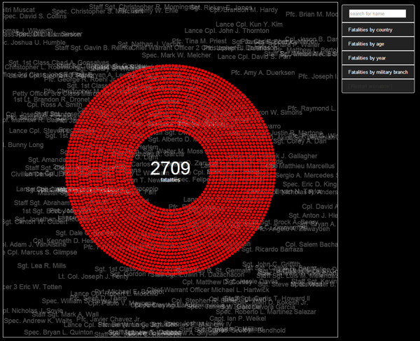
This interactive visualization presents the thousands of U.S. soldiers killed in Iraq and Afghanistan between 2001 and 2014.
The data came from the Washington Post’s Faces of the Fallen site, which contains an impressive collection of information including the details behind each fatality alongside a photo. I appreciate the way the Post has humanized the loss of so many soldiers and I wanted offer a visualization of the individuals related to a big picture view of the total. To do so, I plotted all 6,774 data points separately rather than aggregating them in simplified charts.
It was a challenge to plot so many points in a visually interesting way and to do so while honoring those who have paid the ultimate price. How could it be improved?
Tim has posted the project on his GitHub page, the source data is available here, and you can get directly to the interactive by clicking here.
I like the visual itself. It appropriately makes me feel a little overwhelmed. Perhaps you could add a speed slider so a user can control how fast or slow it builds. I’d also suggest a different font. This one looks fairly generic and adds some flavor of amateur that pulls down the viz.
Stephanie:
Great ideas, thanks. I’ve replaced the stock fonts with Open Sans + Oswald. Please reload the same link above and let me know if that works for you.
I’ll explore the slider idea in a bit. I already have code that controls the speed internally, so it won’t be too hard to try that out.
-Tim
The start, and general pacing is very similar to the periscopic gun deaths visualization. Not bad or good – just noting many parallels between the two.
Is this vis in some way related to the latest data is beautiful challenge? http://www.informationisbeautiful.net/2014/dataviz-challenge-design-a-page-of-my-new-book/
I found myself looking for overlaid titles for the different groups in the dot-pie charts.
I think the dot-pie chart works for some of the metrics – but not others. Using a simple bar chart at the bottom of the vis for deaths-by year – that was updated during the initial animation might help keep peoples interest during the flashing names and increasing number of dots.
The age groupings don’t really work that well in the dot-pies. I would consider larger groupings of ages (35 – 45) or some such.
It would be a lot more work – but if you could perform additional filtering – like give me the break down of ages for just those that were part of the marines, or show me branch by year – this would add a lot to the ability to move past the animation and explore the data more. Here, I’m thinking of scrubbing on smaller charts – like in http://selfiecity.net/selfiexploratory/ – might be an effective way to perform this exploring.
Thanks for the feedback Jim.
This vis is not related to the latest information is beautiful challenge, but my next one might be. Thanks for pointing that out.
I toyed with a few ideas for adding titles to the different groups in the pie chart, but ended up keeping it simple by highlighting the sorted value in the rollover. Perhaps it is not the best solution, but I thought it would get too cluttered if I added labels all over the place – especially for those items with so many variations (like fatalities by year). Did you find that too hidden?
Your age grouping suggestion was great. If you reload the vis you will see it updated based on the groupings you suggested.
The selfiecity example is a very engaging visualization, but I’ll have to think about the exploration I want here. The main message of the vis is to personify the 6774 fatalities, so my exploration should back that up. I do have additional data that I could explore, such as the cause of death for each soldier. That might be an interesting way to proceed as well.
– Tim
A strong message in your visualization – especially the way you treat every single fatality equally!
The interactivity is very intuitive and smooth – and I feel it really encourages me to explore the data.
A couple of things I would consider regarding the dot pies and the colors:
– Initiate pies at top (12 o’clock) and move clockwise.
– For the categorical data (like Country or Branch), sort the categories after number of records.
E.g. it would make sense to start with ‘Army’ being the largest category, then ‘Marines’ and so on.
– Apply sequential color scales (rather than categorical) when showing Age and Year in order to display the movement in time – e.g. from light color saturation for early years to full saturation for late years. A side remark is that the green and red slices in the ‘Age’ dot pie are probably a bit hard to distinguish for colorblind people. At colorbrewer2.org you can find both sequential and categorical scales that take into account red-green colorblind deficiency and general legibility.
Thanks for the feedback Ulrik. I appreciate the suggestions and just updated the viz with the first two. I didn’t have time to get to the third tonight, but I’ll do it when I have time.
Funny I didn’t think to use a mix of sequential and categorical scales, but now that you mention it – it seems obvious.
In case you are interested, here is the viz that I originally submitted:
http://goo.gl/BSVFlC
And here is the updated one with changes:
http://goo.gl/tvT4PK
I’ll post another note when I have time to do the rest.
-Tim