Mapping Program Participation by State
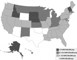
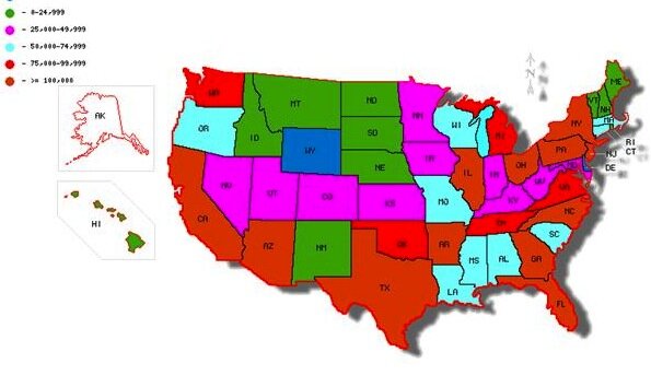
A team of researchers is writing a paper on a particular kind of program for older adults in the U.S. (because the work is incomplete, they prefer not to share too many details). The number of programs varies by state and the states in turn vary by the share of the older adult population (age 65 years and older). Their first visualization—the map shown here (using this data)—plots the quintiles of the number of adults per program.
The researchers are seeking help on three issues. First, should the visualization plot (a) the number of programs per 100,000 people or (b) the number of older adults per program? Second, if they create the map, what software program should they use (this map was created using this ‘Map Maker tool‘)? Third, what color scheme can they use that is consistent with black and white printing?
***UPDATE***
The research team sent in this updated map and wanted to thank everyone for their help.


RE: The three issues:
1. Those are two very different measures: “programs per 100,000 people” would show the availability/diversity of programs, whereas “number of older adults per program” would show how much of the populace is actually participating. Unless the research is focusing on one of these, both of these would be interesting/helpful measures to look at. I’d encourage making a map of each.
2. There are several options: A GIS program (such as ArcMap, or the open source equivalent QGIS) would be the gold standard, but might be overkill for the simplicity of the map(s) needed. Honestly, I would just get a blank U.S. map (e.g.: http://commons.wikimedia.org/wiki/Category:SVG_maps_of_the_United_States) and construct the map manually in a graphics program (e.g. Inkscape or Illustrator).
Assuming these are university researchers, they may want to see if there are cartography or GIS experts in their Geography department. They’d be able to provide resources and/or hands-on guidance.
3. The only color palette that will be acceptable printed in black and white is shades of grey. Fortunately, that’s all this type of choropleth really needs. If you’d like, reference http://colorbrewer2.org/ for an example palette.
Remember that the best practice for choropleth maps is to ensure that, when portraying quantitative data like this, the color scheme goes from light-to-dark, with the darkest colors representing the highest numbers.
Other notes: please make sure the final product is, erm, pretty. That means no bad jpeg compression, no blobby drop shadows, no unnecessary north arrow, and a legible font in the legend!
You should consider not using maps at all. I know it’s what everyone does, but the stuff you’re measuring has nothing to do with land mass or surface area. The most prominent visual feature of a thematic map is the size of each state, which is actually completely irrelevant. A bunch of populous (and therefore significant) state are nearly invisible. A ordered bar chart might be more effective, especially as it would should the scale of the difference.
But if you have to do a map, Google Fusion Tables is definitely your easiest option. It’s free – you’ll have to ask Google to activate Fusion Table Maps on your account, but that shouldn’t be a problem if you’re at a university.
Also, nobody is navigating with this map – you don’t need a compass point. And don’t use drop shadows – America does not physically cast a shadow.
Thanks for the comments — these are really helpful. I’ll send Jon the updated version to upload when we’re done with it.
A bit late for the party, but here goes:
An alternative approach to making two separate maps, could be to combine the two measures into one. If we group the states in above or below average for “programs per 100,000 people” and for “number of older adults per program” respectively, we get a total of four cathegories:
1. high ratio of programs per 100,000 people & high number of older adults per program
2. high ratio of programs per 100,000 people & low number of older adults per program
3. low ratio of programs per 100,000 people & high number of older adults per program
4. low ratio of programs per 100,000 people & low number of older adults per program
Depending of course what the focus of the research is, this way of presenting the data will hopefully tell a more comprehensive story. Plotting the cathegories on a map will give a result along the lines of this:
We’re a group of volunteers and opening a new scheme in our
community. Your site provided us with valuable information to work on.
You’ve done a formidable job and our entire community
will be grateful to you.
my web page … veterinary assistant schools