Plotting Multiple Groups and Multiple Series
This submission comes from a work in progress using restricted data and the user is unsure of how to plot the data. The data consist of three different Groups, each with five different Series. The author wants to look at how the Groups differ relative to the other series, both in the initial starting point (in 2006) and how they change over time. For example, Group 1 starts at a higher level of Series B and the decrease in Series B is much higher for Group 1 than for the other Groups. (Here’s the data.)
The problem is that the author doesn’t like using lines to connect across the Series because he think it leads the reader to think about a time series or a continuous outcome. If he just uses dots then it is harder for the eye to compare across the groups. Bar graphs are probably the best idea, but he wants to show all five Series, which he thinks may be too cluttered.
Another possible way of showing things would be to make a time series (he can generate the values for the other years) but thinks that approach still suffers from wanting to show too many dimensions at the same time.
Would something like this work? Nevermind the squares and gradients and labels if you don’t like ‘em, but the idea is that you really want to visualize the extent of change across the dates, so we should have some strong visual variable (height of the ‘dumbbell’, in my case) that represents that.
In this particular instance, it’d be very easy to compare the start/end points of each group, and the extent of their change.
You can also flip the organization around (‘sections’ being a group instead of a series) if you want to emphasize “series-across-groups” instead of “groups-across-series”.
Marty – are you using Excel or some other program for creating this chart? Can you share what program and the setup? Thanks!
Could a series of simple slope charts work? Something like below? You could add each of the other groups in a light grey which might aid comparison but I tried it and it seemed to clutter things too much.
I like the third option best. Although, a little more context for the data would be helpful to understanding what it needs to represent. That can be done while maintaining anonymity.
It’s not clear if the author is plotting “change” instead of the 2006/2010 values because only the change is important or if he is applying a summary just to reduce the amount of data to be plotted.
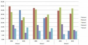
Below are some samples (sorry about the artifacts of cramming them into one image file). I like Matthew’s slope lines, but if the overlaying suggests a false hierarchy, you could expand the lattice in both directions as in my first graph.
The second graph has the same information with an emphasis on the change by using colored range bars to connect the 2006 and 2010 values.
The third graph may be good if the author really only cares about the change. It uses a heat map to show the 15 change values with a neutral structure and no notion of continuity. However, color is not so precise a value representation if that’s important.
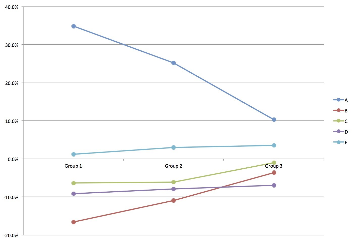
This is essentially time series data (2006-2010) and so the story is going to be about how something is changing over time. It helps to make this example more concrete, so I’m going to assume that groups 1, 2 and 3 are countries (North America, Europe and Asia) and A,B,C,D,E are products (eg. mobile phones) and the numbers represent market share (they approximately add up to 100% in all cases).
So we want to show how market share is changing in 3 countries. That means we have 3 graphs, which we’ll place side by side to facilitate comparison. Because we only have 2 dates, we’ll use a slopegraph and show the direction and magnitude of change by the slope.
Finally, we need to make some kind of conclusion from the data and summarize that in the graph title. We ignore things that are generally the same between the 3 countries: the slopes for D and E are about the same in all 3 countries. The big story is how A(ndroid) is surging in all three countries, from 0% market share to 10-35% market share. We’ll highlight that point using thicker lines and color. We also see B and C are declining in all three countries. We’ll make this a secondary point, use dotted lines (to indicate a weak line) and color code them red (danger).
Finally, we sort the graphs in some intelligent order: from North America (biggest change for Android) to Asia (smallest change for Android). Voila! An easy-to-interpret rendering of the data.