Plotting Internet Use
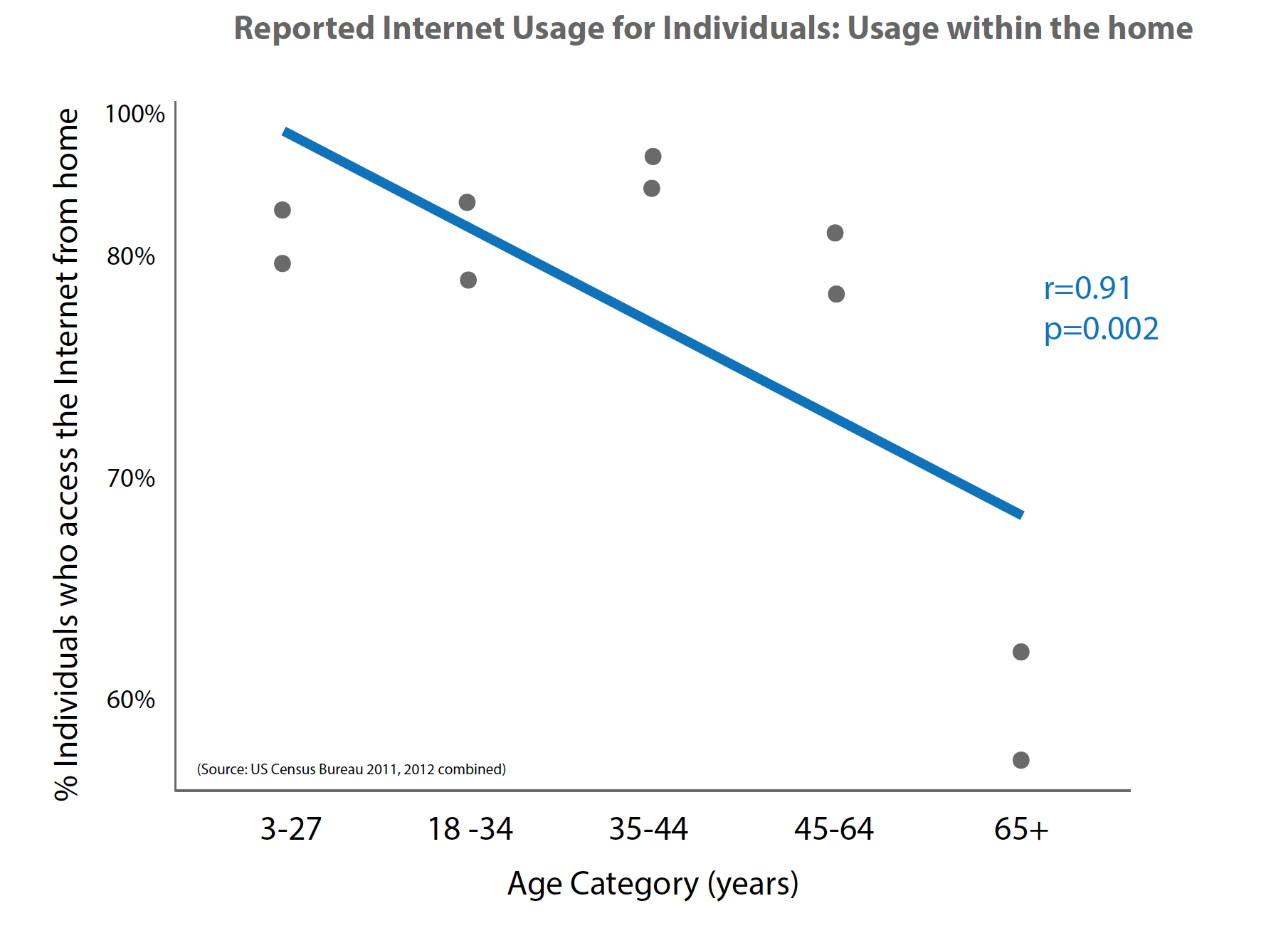
I want to use Census data to examine the relationship between Internet use and the age of people in the household. Because all the values are so high (towards 100%), it might appear strange to have so much white space if the axis started at 0, but then the graph may be misleading without it. One of my other challenges was that the y-axis does not start from 0. As it is, I feel that the visualization is rather imbalanced. Perhaps it would have worked better as a bar graph, as it would help to deal with the white space a little better, but then the bars would all be very close to the 100% line.
One major problem with making this a scatterplot is that the variable on the x axis doesn’t change is a continuous way (it’s lumped into categories). To get a sense of why this is a problem, try to calculate the slope of the line you’ve drawn. (You’ll find it’s impossible!)
It’s also confusing why there are 2 dots for each x value — I think they represent 2011 and 2012 data? But there’s no color coding or key. You can probably make the same point with just 1 year’s data.
As you mention, a bar chart might be the best bet. Sure, the values are relatively high, but there’s real differences that will be visible on a bar chart. Since they’re percentages, you might consider doing a fixed height stacked bar chart, like this second example http://rgraphgallery.blogspot.com/2013/04/rg-stacked-bar-chart-number-and-percent.html
Looks like you plotted the % of those who live with the internet category rather than of those who access from home…
I think instead of using two separate values by year for teach age group, it should be the average value? Access from home is a parabola, not a linear relationship: the % of usage peaks btw 2nd and 3rd age categories (18-44), then goes down (so R wouldn’t apply). For those who live with internet, the value slightly decreases fro 2nd age category (18-34) then goes up and decreases again after 44.
Great comments, everyone! I did indeed use the wrong data/labels, and of course it would have been simpler to average the years together, rather than plot each one! There are three sets of data for Internet Access in the Home, Internet USE in the Home, and Internet Access/Use elsewhere. In retrospect, it would have been more interesting to be able to contrast these three sets of data within and across age-groups. For example, the oldest group tend to have access at home, but to have low actual usage. The same goes for the youngest age bracket. This is not surprising, but would make a more interesting chart.
I believe that a bar chart could have been a better way to compare internet usage percentage among different age group categories, for the two years. Even without trying to find a correlation, one might notice that the biggest percentage change for internet use is for the 65+ users.
I read a lot of interesting articles here. Probably you spend a lot of time writing,
i know how to save you a lot of work, there is an online tool that creates unique, google friendly articles in minutes, just
search in google – laranitas free content