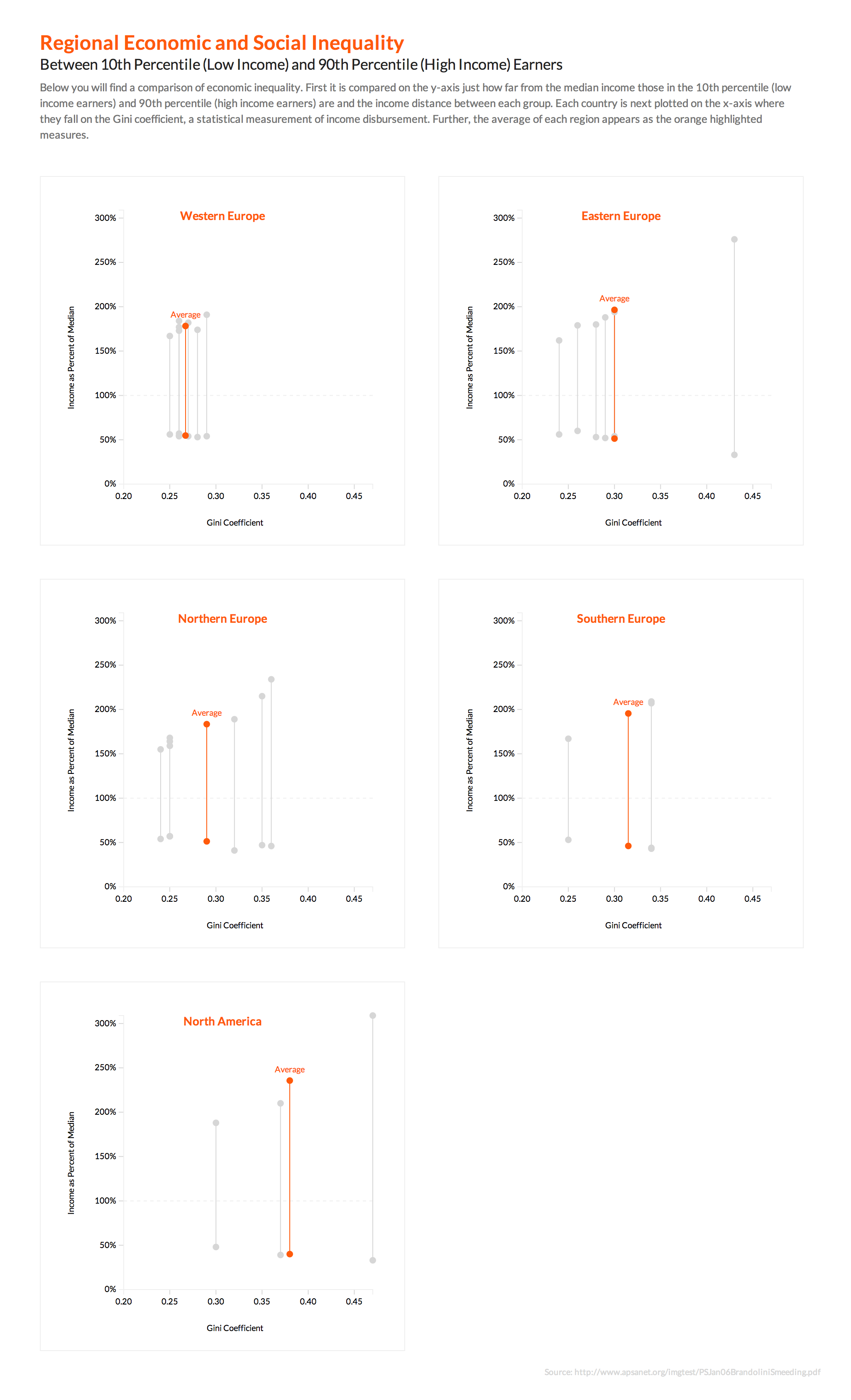
Cross-Country Inequality
For this visualization I decided to focus on the economic inequality within regions represented by the data. Highlighting each region with its own chart, one can see the dispersion of social equality or inequality within each region. I also chose to focus a viewer’s attention on the averages of that group. I decided that on the y-axis to show just how far from the median income those in the 10th percentile (low income earners) and 90th percentile (high income earners) are and the income distance between each group. On the x-axis each country is plotted on the x-axis where they fall on the Gini coefficient. As a static piece one can only view the averages with the other countries ghosted in and it still works. But in an interactive version one can mouse over and reveal which country is which.
I really enjoy the multiple charts. As a viewer, I can easily compare and contrast especially with the interactive version. I think using the median to compare low to high and highlighting the mean was a great way to analyze the disparity as well. I wonder if you could just visualize the Top 10 European countries, how would you do it? Also why include North America? Great job!
This looks very clean and objective. The interactive version is great, too. I agree with Brittney that highlighting the average was great as an added comparison point for the rest of the data on each chart. I was a little confused by the distributions of European countries as countries I expected to find in one “region” were actually in another. I think other viewers who have an interest in a particular country would have similar problems finding their own. Perhaps adding a mini map for each one would facilitate? or a map with the regions colored differently, and then use THAT color for the “Average” line for each specific chart? I am ask unfamiliar with the Gini coeff, but after seeing where Russia and Mexico were, I think I understood. One last thing: are you showing Social Inequality? It’s just a minor point, but the title includes Social, but the description only discusses economic.
Great job, though – a unique perspective.
Following Jennifer’s comment, that it’s not easy to locate countries of interest, I plotted all countries in one chart (didn’t include any averages, but that’s easy to do). Hope you find it useful.