Income Volatility Line Graphs
Bradley Hardy from American University sends in the following request:
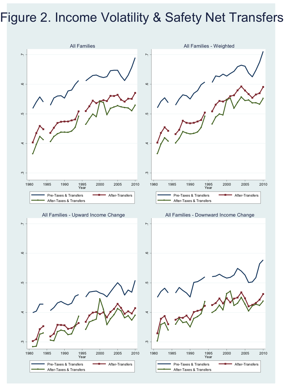
I’m trying to figure out how to create “nice” panel charts in excel, where I’m currently attempting to do so in Stata. (See for example Figure 2.) I can easily do the individual excel chart, but my investigation online into making this a 2X2 set seems to involve using pivot tables, and even then I’m not quite convinced it will work out as I want it to. I wanted to reach out in the event that this is something you or others have done before – Excel trend figures side by side for comparison purposes…also known to some as panel charts. This allows the reader to view trend lines across different groupings over the same scale to make helpful comparisons.
The data are available here.
Here is the Excel file Ira suggested.
The 2×2 set is a bit confusing for me.
Thanks for this suggestion. I agree that it is (now) easier to look across one row. Can you share the underlying spreadsheet for this 1X3? It looks as if it is in excel.
Voilà!