Visualizing Banker Honesty
This request comes from Patrick Asea, Associate Professor of Economics at the American University of Afghanistan.
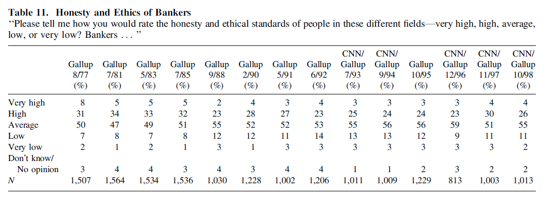
How would you best visualize the data presented in Table 11 of this paper (data here)? Any advice would be greatly appreciated. If possible I would like to retain all the information in the table.
Thanks.
Here is a stacked and separated bar chart option made with Excel. I think this makes comparisons within each category easier to see than a “typical” stacked bar chart.
One design change to this version would be to put data labels on the outside end of each bar. (Because of how I made this in Excel, that’s not possible without manually changing it. I don’t have the time to do that right now.) I would also make some general alignment fixes with more time.
Kyle,
Many thanks. Can you provide the excel sheet?
Here are a few more options:
http://public.tableausoftware.com/views/BankerHonesty/AllTogether
A couple of notes:
– I wish there was a way to edit comments on this site
– In the underlying data, the values for Nov 2004 add up 106%, a little outside the range of rounding error
– In two most recent years, 2009 and 2010, the Low+VeryLow is greater than the High+VeryHigh, in 2008 they are equal
Thanks. The vertical divergent captures the key idea brilliantly. I followed the link but was not able to download the figures. Please advise.
Depending on your screen size, you may have needed to scroll to the right to see the link, here is the the direct download link: http://public.tableausoftware.com/download/workbooks/BankerHonesty?format=html
If you do not have Tableau Public, there is a link on that page as well.
More or less, similar to Kyle’s idea. Just used some conditional formatting on the data table.
If the point of this is to understand the trend of opinion over time, Joe Mako’s bar charts do a good job of that by downplaying the largest category–“average.”
I find the trend most evident in the vertical divergent chart, probably because the x axis is used as the time series and up = good.
The horizontal stacked white space variant still allows you to see the trend but makes the considerable “average” category explicit (without making it the focal point), so it feels like a fuller picture.
The part of me who cares about such things is bothered that the intervals between surveys are not uniform, and is thus drawn toward the line chart, which is also the only one that doesn’t lump “no opinion” responses in with “average.” For the purpose, though, it’s harder to construct a story of changing sentiment by looking at this chart. I might be tempted to lump together low/very low and high/very high if I were committed to this format, just to see whether this clarified anything.
And here’s the output of my temptation.
It’s counter-intuitive, but (in my opinion) rolling up the data like this makes for a clearer picture. The original request was to retain all the information in the table, but I would lean toward creating a simple picture to tell the story and retaining the table for those who want that level of detail.
Jeff
This takes Jeff’s idea to the extreme. It’s a weighted average of each poll’s results. very low .. very high are: -2, -1, 0, 1, 2.
This is a case of more work for the author (because you have to justify your scoring) to make less work for the reader.
In general, I like Kyle’s view of “all the data,” and Joe’s upper left view is probably best overall for showing most of the data and the overall trend.
Two drawback’s to the stacked bars that don’t exist in this line chart:
– time is represented categorically, which exaggerates the rate of change for the early polls that were taken less often.
– high and very high make the same contribution to the bar height, which is the main perceptual component. For instance, the ’77 and ’81 polls’ bars are the same height but have different make-ups. Of course, it’s not a significant difference here, but could be in general.
Also the line view allows for a confidence band if you can compute it.
Of course, the mean line hides any polarization. For example, it doesn’t distinguish all average from a balance of highs and lows.
I agree with Jeff.
I think his chart conveys the message quickly and clearly. IMO retaining the numbers distract the reader and make it slow to interpret.
Thanks very much for these excellent ideas! Much appreciated.