Trajectories of Obesity
This request comes from Joyce Lee at the University of Michigan.
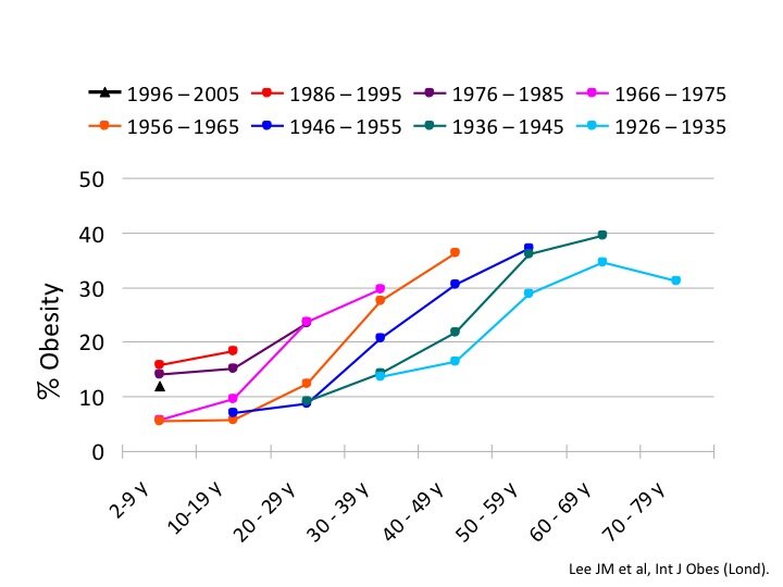
I published this paper long ago on trends in obesity over people’s lives. The images from that paper can be found in this PPT file (the data is embedded in the charts).
I am trying to show the changes in obesity over time for birth cohorts, but I have been told that these graphs are really hard to understand. I am looking for feedback from others about how to more effectively communicate these trends. In this iteration, I will be creating an interactive version of the graphs, but am first looking for help on improving how the data are graphically displayed.
A big problem is all the cross referencing that has to be done between the data and the legend at top. There’s nothing about the colors of the lines that suggests a sequence, so even if you understand what’s being graphed it’s not obvious what the conclusion is. Here’s an approach that puts the data labels on the graph.
Thanks for the suggestion! It looks much better!
Another thought that occurred to me is that the lines moving to the left may not intuitively communicate the trend. I’m wondering whether this arrangement, showing profiles by age instead of birth year, might be a clearer way to encourage that comparison.
I think a bubble chart would be a good way to show this data in an interactive way. I’ve mocked up a possible bubble chart here. This helps compare across age groups as well as by year of birth. You could do the same for gender and race to make it interactive.
The last column should, of course, be 1996–2005, instead of 2004. Sorry about that.
Hi Kyle. I would like to know how did you build that bubble chart? It’s amazing.
Thank you for your kind words, Ira. The short answer is that I created a scatterplot with a “spacing” value as the Y-axis, the years as the X-axis, and the percentages as the bubble size. I did a lot of touch-up in PowerPoint to get the final product I posted. (I have a very limited tool set…)
If you send me a PM on Twitter (I’m @kpeters0n) with your email, I’d be happy to send you much more info and a clearer step-by-step instruction.
Another option for a static version is to use small multiples and grey out all the series except the one (or maybe two) you want readers to be able to see (see picture).
An interactive version might look like the “Interactive Time Series Chart” tutorial Nathan Yau over at Flowing Data did a few years ago: http://flowingdata.com/2012/04/04/interactive-time-series-chart-with-filters/. There, the lines are all grey until the user chooses one and that line then turns color.