Where in the World Are You Invested?
Joe sent in this request earlier today:
I’d love some feedback on a viz that was just posted here:
https://www.betterment.com/blog/2014/03/19/portfolio-diversification/
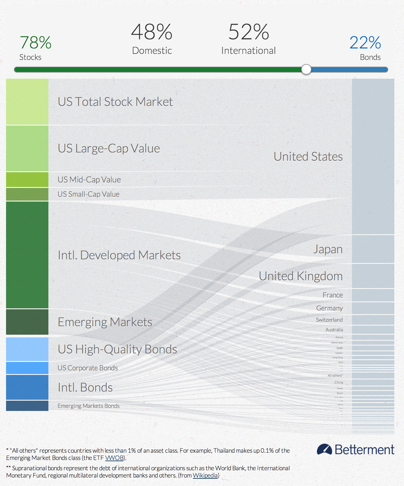
My challenge is to visually communicate a data set (available in csv format here) with a lot of possible combinations (12 ETFs, 102 countries, 101 allocations). I’m using a Sankey diagram to show the relative sizes of constituent parts and links and users can drag a slider to change allocation. There exists a lot of of extra data in the hovers.
Thanks!
Hi Joe,
Could you perhaps give us a reading of your graph above, to clarify how it should be interpreted? For instance, does the one above mean “If you choose to allocate 78% of your investments with Betterment, then 4% will come from the US small-cap value”?
By the way, regardless of whether this is the right choice of graph, the implementation is very elegant. Well done.
Thanks.
Thanks Francis. Yes, you are close to correct in your reading. I would amend the sentence to say, “If you select a Betterment portfolio with 78% stocks and 22% bonds, then you will be invested in asset classes that are held in the U.S. (48%) and internationally (52%), including US Small cap value as 4% of your holdings”.
I have a similar question. With Betterment, can you really fine-tune these components down to the percentage point?
A few other notes.
I think the four percentage values across the top are slightly confusing. The color coding and the sizing differences help but I wonder if you could tie the slider to the vertical axis on the left in order to make that relationship even stronger.
It seems there are only a few different combinations below the 50 / 50 mark and lots as you get towards 100% domestic. This distribution might be interesting to show if breaking out the range of options becomes important.
Agree with Jon that this is beautifully executed. The sentence structure in the hovers is my favorite detail. Nice work.
Thanks Bryan. Yes, the graph does accurately represent the portfolio options for a Betterment customer. There are 101 possible portfolios ranging from 0% stocks / 100% bonds to 100% stocks / 0% bonds.
I had the same thought with the vertical slider on the left. An earlier version had that layout, but the relatively narrow frame for this use made it more difficult. If this graphic is repurposed for a wider canvas I’ll certainly try that again.
What if you moved the slider above the domestic/international numbers, and moved the stock and bond indicators inline on the ends, the the slider controls the ends, and everything below the slider is the result of the portfolio split.