Visualizing YouTube Analytics
Hi! My name is Julie, and I need help visualizing some YouTube channel analytics data over time.
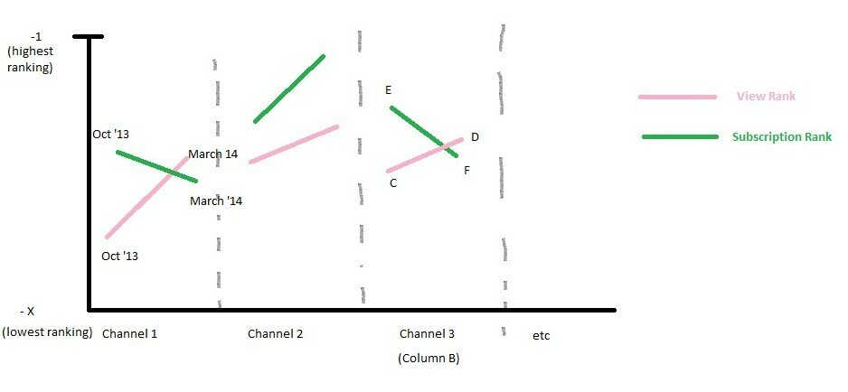
Attached is the spreadsheet I’m working on as well as quick mock-up in Paint of what I’d like the graph to look like.
On the spreadsheet, column B represents each individual series I would like. As in, each cell in column B would be its own column of data on the chart, with two lines, one representing the trend of subscription ranking and one representing the trend of view ranking. One line will be columns C-D, and another separate line will be columns E-F.
As a note, I’ve made the rankings negative so that a jump to a better ranking is indicated by a line with a positive slope in the chart.
I’m hoping this is possible to do with excel, but so far all my efforts have been thwarted. I’m willing to use an app or other software for this, provided it doesn’t require programming skills.
Help!
Julie,
In Excel, I think all you need to do here is to organize your data such that you have a space between categories. Then you can just create two line series that will show the separate segments. I’ve added the breaker lines as you drew them by adding a scatterplot series with the x values set at the basic increments and the y values set at 0. I then added a negative error bar equal to the height of the y-axis (14,000). Note: When you set this up, be careful to extend the series one row above the first number and one row below the last number. This will get you the spacing right.
Jon
I wanted to add a second post to point out that this approach may not be the best way to do this. An alternative might be a dot plot-type graph where you have connected points for the two view series and connected points for the two subscription categories.
In this version, I didn’t bother to add labels, etc.–and I might consider putting the two series on slightly separate lines–but I think you get the idea. Again, I used horizontal error bars to link the series together. It might also be worth sorting the data on one of the variables instead of by Channel number, unless it makes particular sense to sort in that way. Here are two posts about dot plots that you might find useful: http://peltiertech.com/Excel/Charts/DotPlot.html and http://thewhyaxis.info/gap-remake/.
Jon