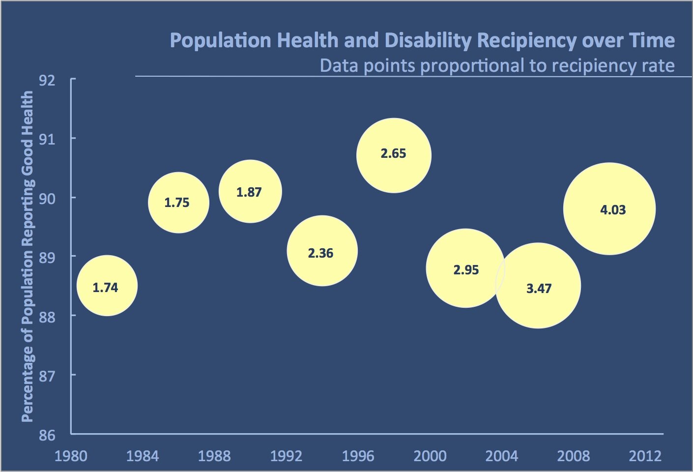
Disability Insurance Recipiency Bubble Plot
Ben (who asked that I not include his last name or affiliation) submitted this graph along with the description found below. The data are available in this csv file.
In this figure I was trying to highlight the fact that although the proportion of the population that reports being in good health has stayed relatively constant over the past 30 years, the proportion of the working age population that claims disability insurance has risen substantially. The main point of this visualization should be to break the preconceived hypothesis that the underlying health of the population is the primary driver of rising disability insurance recipiency. I think the way the figure is currently presented doesn’t do a great job conveying this. Any help is appreciated!
If I understand this chart there’s a time line from left to right and the position of the circles represent the percentage of people reporting good health. And from he blurb the numbers in the circles are the percentage of people claiming disability.
For me, the distracting part is the number in the circles as their values don’t correspond to any type of scale. The three left most values are 1.74, 1.75, & 1.87 then the fourth value of 2.36 is set in the middle of the first three values and the rest of the values follow suit not following any visible scale.
I think a bar chart with two two bars representing 1) good health and 2) disability claims might be clearer. That way the reader could see what they’re comparing. Though I normally don’t like the use of a second Y axis scale, this could be the answer for this data.
Would it work to just plot health against disability and use the dates as labels? I’m on a relative’s computer so have no access to anything above Excel 2003, but this would be my initial sketch of what I’m thinking of.
I think it shows that the trend in recipiency is upward but that there’s no obvious trend either way in health status.
Matt,
This was my first thought as well–the connected scatterplot approach. My only major change would be to rotate the graph 90 degrees. In this way, the years run from left to right, which is a bit more intuitive.
Jon
Ben’s circles demonstrate that relative constancy in that the percentage varies only within about 3% over time. While I like the connected scatterplot and agree that turned 90 degrees would help, I’m afraid that sense of constancy would be lost unless the axis were to start at zero, thus eliminating the steep ups and downs that give the reader the illusion of wild fluctuations. Of course, if variations of up to 3% are indeed significant variations when we’re talking about population, and you want the reader to see this vs. the relative constancy of points remaining in a narrow band, then the axis that only shows 88-91 would be appropriate.
Agree re rotating – I did it both ways and attached the wrong one! Re variability, the suggested plot looks pretty flat if you use the original scale from the bubble plot – but like you I don’t know whether 3% is a large or small variation, so I set the axes purely based on the data.
I agree with Sheila (except the min/max difference is a mere 2.2%). Here’s what it looks like with the axis starting at 0 (thickness showing recipiency). Showing the chart in this way would enhance your point, Jon. I guess it leads me to ask, if health status isn’t driving disability, what is?
Kim,
I agree that this chart shows the constancy of the health status line, but not so sure that the thickness increase helps drive home the point about the big increase in recipiency rate (it’s not absolutely clear to me without looking at the key that the rate has more than doubled)
I’m just wondering whether it would be possible to plot something more like (100-health status) – this is also fairly consistent but much lower, and presumably represents the proportion of people not reporting good health(?) which may well be the metric of more interest when looking at drivers of increased recipiency rates. There’s also less white space (though maybe still too much?) when starting both scales at 0.
Hows about this? It shows the stability of the health status vlaues and makes it very clear that disability recipiency has been “on the rise”. If you wanted to explore Kim’s musing about what is really driving the recipiency rate, you could add in some other data, like average age of recipients (size or color ramping on the Recipent Rate (circles). Another interesting piece of data might be the proportion with or average number of multiple comorbd conditions among the working age population – again varying the color of the bars to make it clear; alternatively, the bars could be annotated or labeled with that information.
Peace and All Good!
Michael
Or,
I like a scatter plot matrix for comparing variable pair relationships. For a less technical audience, presented them as separate graphs may work better. The regression line and confidence interval suggests the degree of correlation.
I think Matt is on the right track with plotting the 100-health status. The lower figure allows for clearer comparison between the two numbers.
I like the simple line chart over time using the same axis as opposed to Michael’s secondary axis for the proportion claiming insurance. I think this exaggerates the difference, in the same way starting the vertical axis above zero distorts the highs and lows.
Plotting the lower number (100-health status) and actual recipients on the same axis over time shows the disparity.
So what’s the reason? Are people simply more aware that they can claim than they were in 1982?
Another approach might be to index the values to show the change over time. This gives a more dramatic effect of how they have diverged.
We can see from the chart that 2.32 times as many people are getting disability benefits in 2010 than were in 1982, while those reporting poor health in 2010 is below 1982 levels.
Here is a horizontal dot and bar chart with the labels subdued. This lets us see that the Recipiency Rate is increasing each year, while there is no correlation to the Health Status.
For those of you pondering the relationship between reported health status and disability recipiency, remember that a 60-year-old reporting himself in good health is likely to overlook more afflictions than a 20-year-old. This isn’t the whole story by a long shot – there has been a rise in disability recipiency for other reasons, but the self-reported health status isn’t likely to catch the full impact of the aging boomer population.