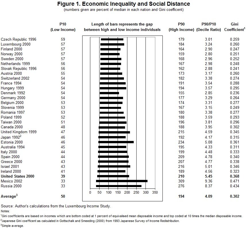
Inequality Bar Chart
This bar chart from Tim Smeeding, Director of the Institute for Research on Poverty at the University of Wisconsin, compares income distributions in 31 countries for various years using data from the Luxembourg Income Study. The figure shows the relative difference between those at the bottom of the distribution (10th percentile) and those at the top of the income distribution (90th percentile) as well as the ratio between those two points. Because those measures focus on only two points in the distribution, an additional measure of inequality (the Gini coefficient) is presented as well. Are there better ways to show this data?
To me the bars don’t read clearly as gaps at the moment. I might suggest something like the dumbell variant Andy Cotgreave played with here. You could even tie the P10 and P90 values directly to either end of the bar instead of aligning them. This would make the somewhat distracting grid lines less necessary.
I second the dumb-bell chart idea. I’d also consider reporting on the figures as concrete dollar values – “$87,000″ is much easier to wrap one’s head around than “179% of the median income.” I might also ditch the years from the country labels in favor of a blanket footnote along the lines of “Date of data collections differs by country. See XXX for details.” Finally, I’d order the bars by lowest to highest gap, or vice-versa.
I agree with Bryan, the bars doesn’t look like gaps. Also, ordering by gap would remove some noise when visually scanning the composition.
I generally agree with Bryan’s post.
I’m also not a fan of the outer box around the bars. It doesn’t really serve a purpose but encloses the bars away from the rest of the data making the reading of the table from left to right more of a chore than it could be.
I would flip the axes and then do a line plot, one each for P10, Gini x 100 and P90. This is tufte-esque and conveys the key messages very clearly.
I’m still trying to wrap my head around what the P10 and P90 numbers are. “Percent of Median?” What? So the 90th percentile figure (say 210 for the US) is the percent of the median top 10% of incomes? That makes no sense, right? Can someone unravel what those values mean? Then I think I can offer some critique/advice.
Kim – I couldn’t say for sure but I think it’s like this:
Assume you had 100 people in a country, and lined them up in earning order from lowest to highest. Then the median (P50) person would be 50th in line, P10 would be the 10th person in the line and P90 would be the 90th. To get the figures in the table, everything is divided through by the median earnings.
So taking the American distribution, if the median person earned $40,000pa, then P90 would earn 40 x 210% = $84,000pa (and 10% would earn more) and P10 would earn 40 x 39% = $15,600pa (and 10% would earn less)
Ah, thanks for that explanation. That makes total sense.
So my next question is for Tim. Who is the audience for this? Economists or regular people (or someone else)?
Kim,
In response to your question, Tim emailed me the following: “The chart is for college students in the social sciences interested in inequality and social distance. The chart has appeared in many textbooks and Professors have told me they can build a whole lecture around the country differences (top, bottom, 90-10 , Gini) and what they mean. It can also be useful with a brief explanation of one page or less for regular people–meaning the college educated. I have used it at Swarthmore, Simpson, Central Michigan, SUNY Genneseo and elsewhere for undergraduate lectures, and the students all understood it.”
On a personal note, Tim was my advisor in graduate school and I remember creating these charts for him long ago. It’s ironic that this is the first graphic on this site.
Jon
I’m not so keen on joining together the countries as they’re not directly linked to each other. How about something like this (I think this is roughly what Bryan was suggesting?)
I did a version adding horizontal gridlines but I wasn’t sure they were needed.
A thought just popped into my head – proportionately Mexico is roughly “equally unequal” both ways – ie the median earner gets 3x more than P10 and P90 gets 3x more than the median. But the length of the “median to P90″ part of the bar is much longer (3-1 = 2) than the “P10 to median” part (1-0.33 = 0.67).
It will depend on what exactly Tim’s trying to show, but I wonder whether if the focus is on the length of the bars, it might be better to somehow base this on the reciprocal of the P10 figures?