Gini Coefficient Column Chart
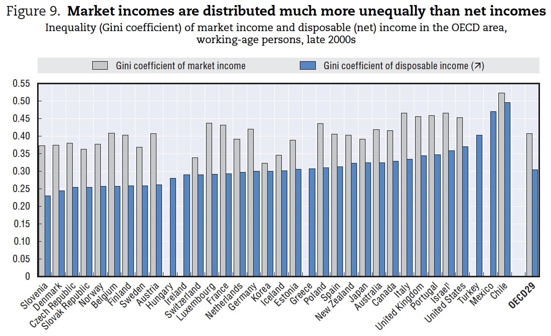
Sam (who asked that I not list his last name and affiliation) is working on a research paper in which he would like to revise this chart from the OECD (original paper and data from the OECD). He doesn’t think the chart does a good job of illustrating the differences in the two measures of inequality, but isn’t sure how to go about changing it. The chart shows two versions of the Gini coefficient (a measure of inequality) for a number of different countries. Thoughts?
My suggestion here would be something like this. Not totally sure of a) the ordering of countries and b) where to put the names of the two series.
Given that we’re comparing the differences between the two measures, I’ve left out totally the countries where only one coefficient is available.
Hi!
It is not clear to me what is the main message that the chart is supposed to convey, is it to show how the difference of the two GINI coefficients vary across countries, or is it to show that one of the coefficients has a greater variation across countries?
I’ve some ideas in mind depending on the answer!
Bruno: The main message appears to be the difference in Ginis *across* and *between* countries. That’s not quite the variation in Ginis across countries (i.e., the variance/standard deviation), but how the two metrics compare to one another.
Matt: I like your approach, though I would make a couple of changes such as make the two shapes the same and link the two with a light line. I might also put the country labels closer to the data.
Jon
Jon – yes can see the reasons for your changes. My only thoughts would be – the measures are clearly different across and within countries – does this mean that connecting results (and using the same label) within countries is appropriate or should we use something to differentiate? Not sure what the right answer is here but the difference between the measures is the reason I changed the symbol.
On distance from vertical – again see the point but how much does it help to start from eg 20%?
Jon – I really like the approach of making them a “barbell” chart.
Matt – I think because a single number is used as a result, even though how they are measured are differently, you can link them. I would order the countries by largest difference between coefficients to smallest since that is what Sam wants to call out.
I also think you can remove the dotted line next to labels and replace the OECD-29 marks with lines across the chart so we can see how countries have changed since the 80s (also a point of comment in the report)
At Locus Insight we’re working on the graphics for a hospitals research project. One of the measures is around inequality between hospitals in terms of data availability for performance indication.
We’re using Gini coefficient and using a bullet chart. The attraction of this chart type is that it can display a qualitative scale as a backdrop beneath the bar.
I can send you a graphic if interested.
Tom
I’m completely unfamiliar with Gini coefficients, but I wonder if it wouldn’t be interesting to plot the two on an XY Scatter plot.