Maps – At a Loss
Michael Taylor from ColdWater Economics writes in the following:
Dear HelpMeViz,
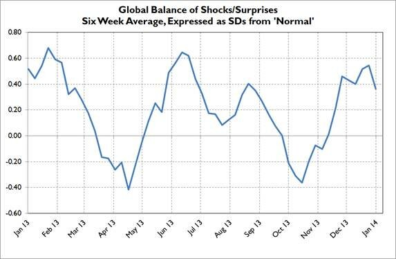
I wonder if you could give me some pointers. I am an economist, and my particular speciality is tracking global data. For this exercise, I am following approximately 400 datapoints a month, in Asia, Europe and the US. At the moment, I have made only very limited attempts to visualize the results, by simply publishing a 6wk trendline, drawn in Excel. Here’s how it looks:
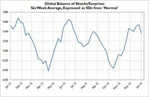
And by region. . . .
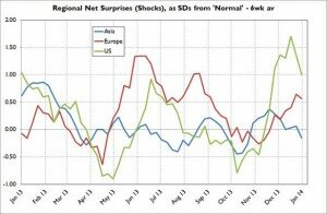
Very standard, rather dull and even, I’d say, slightly confusing (for the regional chart).
What I’d like to do is produce a daily ‘heat map’ schematic featuring the US, Eurozone, Britain, China, Japan, NE Asia and Australia (possibly India too), with a representation of how the 6wk trends are developing in each of these areas. So if things are going well in the US, that bit of the map would show up in gradations of red (or whatever colour seems best), whilst if things are going badly in China, it shows up in the opposite colour. In an ideal world, it would also be nice if there could be a 3D element – in the case offered, the US rising red out of the page, whilst China sinks blue down below.
I have been looking for mapping tools able to do this, but have so far found nothing that can help. Do you have any ideas?
Best wishes
**UPDATE: The data are now available here.
It’s actually a great and useful piece of info.
I’m happy that you just shared this useful info with us.
Please keep us informed like this. Thanks for sharing.
First thoughts would be to change the intensity/saturation of colors, they are all the same mid-level intensity.
For the heat map, look at weather maps, people understand them, you can use different levels of green saturation for above 0, and purple/blue below. I would avoid 3D, cells in the foreground with positive values could block the view of the ones behind. Also the colorization will convey all the message you need.
A map has the advantage of providing a familiar strategy for interpretation. The tradeoff is that you lose a lot of useful information, because it places such emphasis on geography. In this case, you lose two kinds of information: First, color isn’t as good at conveying magnitude as position is. In other words, while red and blue may indicate positive or negative, you lose precision when you’re comparing light blues against medium blues. Second, a map limits you to showing the most recent value–you completely lose the trend.
The trendlines that you started with are the classic way of displaying such data, with good reason. The problem is that it’s hard to compare three things all at once, and the competing colors make it a challenge even to focus on one of three lines. The attached graphic shows three charts that are all exactly the same, except a different country/region is called out in each one. I also deleted the gridlines, which were competing with the data. If you wanted to expand the list of countries/regions, you could use a grid, or trellis, layout.
I understand your desire to make this more visually appealing, but you have to be careful; decoration can interfere with comprehension. (Google “chartjunk.”) The best advice I know is to focus your decoration on the document instead of the individual graphs. For example, you could add flags next to the titles instead of superimposing them on the data.
Hope this helps.
Thanks for this – it’s really very helpful, because the advice is a) not obvious to a visual illiterate like me but b) I can really see how good it is. I shall try and adopt something like it (if not identical). I’m assuming all this can be done in Excel?
Hi Michael–
I like the simplicity of Jeff’s charts. I like separating them out as well. If you want to highlight certain portions of the line to emphasize where things are going well, vs. poorly you can use a gradient on the line. Attached is a very simple example of how my team did this to make a small dip feel more significant.
Hi Michael,
I agree with Jeff, decoration can interfere with comprehension.
If the purpose of the chart is to compare the trends over time in each region then the best way is with a line chart side by side or in the same chart.
If you want to chart more regions then perhaps you could have a check box for each region that lets you turn it off/on to restrict the number of data points in the chart at a time. See the animated image below of a chart I created in Excel.
In the second example I mashed Jeff’s idea of 3 separate charts with Danielle’s idea of the gradient. I can’t say I’m a fan of the gradient (maybe I took it too far with 3 colours), I think the axis is enough to understand the direction and severity of the line.
I personally prefer the charts stacked as it allows me to compare the lines at the same point in time more easily than with them side by side…although with more charts this might become more difficult.
Cheers,
Mynda.
As with Jeff’s comments and illustration, I really am very grateful to you for this. I love your animated chart, and am amazed (baffled actually) that you could do this in Excel. I’d love to be able to produce something like this for my blog. What software would make this easy for me? Once again, thanks and thanks.
Hi Michael – You can do things like this in Excel, but if you’re looking for something cool to embed in your blog have a look at Tableau Public. Tableau makes it dead simple to create interactive ‘Viz’ and if you publish to the Tableau Public server (again – dead simple) you can them embed the Viz in your blog, complete with interactions (allowing views to filter, etc.)
No ‘IT’ knowledge necessary… just watch a couple of their quick training videos and you’ll be up and running in no time!
Here are the other charts:
Way cool! Some extremely valid points! I appreciate you penning this write-up and
also the rest of the website is also very good.
Howdy, i read your blog from time to time and i own a similar one and i was just curious if you get a lot of spam comments?
If so how do you protect against it, any plugin or anything you can advise?
I get so much lately it’s driving me mad so any assistance
is very much appreciated.
Very soon this site wipl be famous amid all blogging and site-building visitors, due to it’s fastidious posts
Pretty! This has been an extremely wonderful post.
Thank you for providing these details.
Hi Dear, are you in fact visiting this website regularly, if so
afterward you will without doubt obtain pleasant know-how.
eternity warriors 3 hack includes a large part in Us Tradition.
A lot of people can often be viewed taking part in
activities regarding eternity warriors 3 cheats. It is in part because men and women of all age ranges could be
concerned as well as households are introduced with each other
by means of that. Normally anyone who features their don’t like with regard to eternity warriors 3
hack android might be regarded as the outcast.
Good day! I could have sworn I’ve been to this blog before but after looking at some of the
posts I realized it’s new to me. Nonetheless, I’m certainly delighted I found it and I’ll
be bookmarking it and checking back regularly!
All the essential codes needed by i – Phone app developers are created by IB.
Through the AL sensor, changes in the phone’s environment are detected and
instantaneously adjust the display’s brightness.
There are maximum possibilities that they might miss out on one or the other thing but, thanks to i – Phone those
busy bees can now organize each day efficiently with
the help of its amazing applications.
After looking over a handful of the articles on your
web page, I seriously appreciate your technique of writing a blog.
I saved it to my bookmark site list and will be checking back
in the near future. Please check out my website too and tell me
what you think.