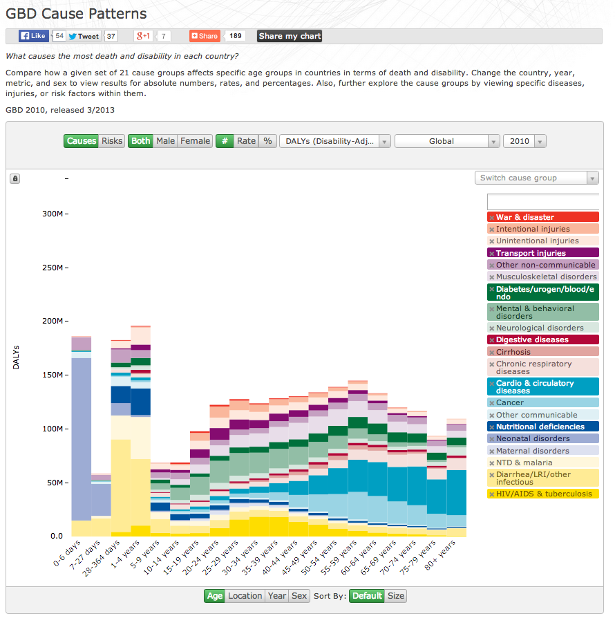
Causes of Death and Disability
Mike Freeman, from the Institute for Health Metrics and Evaluation at the University of Washington, submitted this interactive visualization for feedback and advice. He is requesting comments on three specific areas (but, sorry, the data are not available):
1. Scales: When you switch categories (sex, for example), the scale changes to accommodate the new range. We put a lock icon to the left of the y-axis, but this only allows locking across years. Is there a good way to design scale schemas such that people don’t misinterpret updates when both data and scales change? Perhaps transition the data on the current scale, then change the scale.
2. Uncertainty: There is notable uncertainty around some of the estimates—in fact, I worked on another visual designed specifically to represent the uncertainty in the estimates. Any thoughts on a good way to represent uncertainty in a stacked bar chart?
3. Simplicity versus flexibility: We wanted users to be able to view the data however they wanted—to choose the metric, unit, sex, location, and year. Unfortunately, I think the number of controls can overwhelm users and there is nothing that simply states what the user is actually viewing (space was limited). What approaches have people used to offer simplicity to a broad audience while providing flexibility to advanced/interested users?
On #3, what might help is some sort of natural language sentence structure of the users current settings. This could act as the dynamic title of the visualization, labeling what the user is currently looking at. If space really is limited you could potentially incorporate the current controls into a sentence structure and allow users to change these controls inline. Something like: “[Global][causes] of [deaths] for [males] in [2010].”
> Simplicity versus flexibility: We wanted users to be able to view the data however they wanted—to choose the metric, unit, sex, location, and year.
Who is the audience? Do they know what they’re looking for? What are the interesting/relevant/important stories?
If your audience is doctors or medical professionals doing research, I think you have a great tool. If your goal is public awareness, though, I think you need a bit of curation.
Perhaps add a couple buttons that bring up a short description of some story (“obesity epidemic in the US”?) and clicking them apply the appropriate filters/controls that show a pre-curated graph. The user can then change things to view/confirm/dispute that story from whatever alternative point of view they may hypothesize, but give some interesting pre-determined starting points to show that there are in fact several interesting stories buried in all these cross-slices.
Thanks for the concepts you have discussed here.
In addition, I believe there are some factors that
really keep your car insurance policy premium straight down.
One is, to take into consideration buying cars and trucks
that are in the good report on car insurance corporations.
Cars which might be expensive are more at risk of being robbed.
Aside from that insurance policies are also based on the
value of your car or truck, so the costlier it is, then the
higher your premium you spend.
I’ve been browsing online more than 2 hours today, yet I never found any interesting article like yours.
It’s pretty worth enough for me. In my opinion, if all site owners and bloggers made good
content as you did, the net will be a lot more useful than ever before.