State Migration Flows
In late November, Chris Ingraham posted his interactive remake of a radial network diagram of state-level U.S. migration data. He’s asking the community for alternative approaches. Below is a sample of the text from the alternative on his bl.ocks page, but check out the full post for all the details. The data come from existing tabulations from the 2012 American Community Survey. (Please note that this is a request for help with an interactive visualization.)
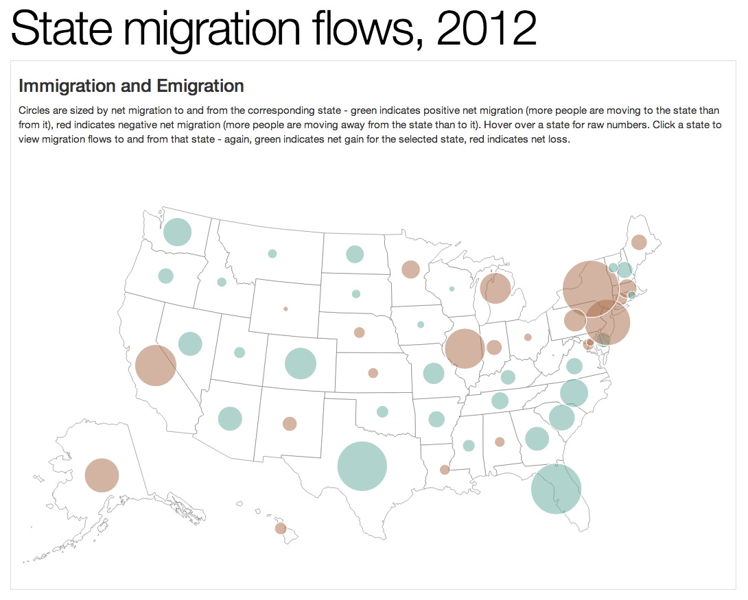
“I thought there might be a better way to display these data, but I wasn’t right. I stuck with a map, drawing circles for each state sized by net migration (comings minus goings) and colored according to whether the state gained or lost residents overall. To get at individual state flows, click a state – paths radiate inwards and outwards from state to state, depending on the net migration flow between the two.”
Initial thoughts are that this looks quite good- you can easily see the broadest geographic trend in the data (people are fleeing the rust belt, heading for the sun belt). Leagues of improvement over the radial chart in that regard. The granularity you can drill down to is also great, although I had to read the into text to recognize you had to click on the circles to pull up the state-by-state data.
The only thing cartographers would probably tut about:
1. It’d be good to have an option to see the data normalized (possibly even eliminate the non-normalized view altogether): essentially percentage of population gained/lost via migration rather than raw count.
2. A legend: although this gets explained in the notes, it’d be good to have a graphic representation of what the red/green and size of the circle means.
The hairball problem: there’s a few avenues, I think.
1. Allow users to toggle between inflow/outflow, as you mentioned
2. Add an option to aggregate the states into major socio-cultural units (e.g. Sun Belt, Midwest, Pacific NW, etc)- this will not only cut down on the tangle of lines, but could generate some insights.
Beyond that, what do you think needs to be improved? Are there insights from the data that you think aren’t being communicated? Is there any part of the visual representation you don’t think ‘reads’ right?
Our studio (locus insight in Ireland) produced this visualization for the international organization for migration (IOM). Check it out at this URL http://www.iom.int/cms/en/sites/iom/home/about-migration/world-migration.html
We were playing about with ways of visualizing two-way movement between locations (people, goods, money) and came up with the concept. It could be refined a lot more. If its of interest do get in touch.
Tom
Chris, here are a couple of ideas to consider.
1 kind of map The size of the state is not proportional to population, which leads to odd dot/state combinations. Putting the same dots onto a map where the size of the states is proportionate to population would help. (Such maps do exist, but I don’t know where to refer you.)
2 flows The length of the flow lines gives added weight to longer distances, which is not really relevant. Remove the flow lines, and when the source state is clicked, switch to another marker in the receiving state, proportional to quantity – ie, when showing flows, the dots change to boxes or some other symbol in the receiving states, sized proportionately. This also eliminates arrow congestion in the Northeast
Hope this helps.
What a coincidence to find this visualization here.
I’ve seen it on Christopher Ingraham’s blog a few weeks ago and liked it’s style and interactivity so much, that I decided to take it as a prototype for our newest project on mappable.info.
The project itself aims at exploring the potential of phone directories for urban analytics. An important part of it is a visualization / exploratory analysis of approx. 50.000 intra-city relocations in the city of Berlin.
In our approach we made two major adjustments to the original version:
1. We didn’t use proportional circles to symbolize the net migration by state due to the generally limited ability to estimate values correctly from circles. We chose a diverging choropleth map instead.
2. To deal with the hairball problem, which in our case was even worse thanks to the higher number of elements, we integrated buttons. Just as suggested in one of the comments above, those buttons allow to hide all lines of the flow map which represent positive/negative net change relations.
Finally, we added a reset button for switching between the two map views, turning the whole visualization into 2-maps-in-1. One choropleth and one flow map.
You can check out our interactive map here: http://dl.dropboxusercontent.com/u/54512470/Telefondaten_VIZ/index.html
The source code can be found here : http://github.com/PatrickStotz/Berlin-A-to-Z
And here’s the project description: http://mappable.info/a-to-z
Cheers
Patrick Stotz / Achim Tack – mappable.info
I was going to post something about just coloring in the states proportionally to in/outflow, and using a blue/red color scheme instead of red/green for colorblind people, but you beat me to the punch! Berlin visualization is indeed excellent. I think it would be slightly more intuitive if you added arrow heads on the migration paths to indicate net in/outflow.
Thanks!
Yes, arrow heads on the migration paths would definitely add some clarity. Though it might be quite challengning to implement them (at least for me). But I’ll give it a try.
And I think we’ll normalize the data for our choropleth map (migrations per pop.) as already suggested in the first comment and in some tweets yesterday after publishing our map.