SNAP Participation & Outreach
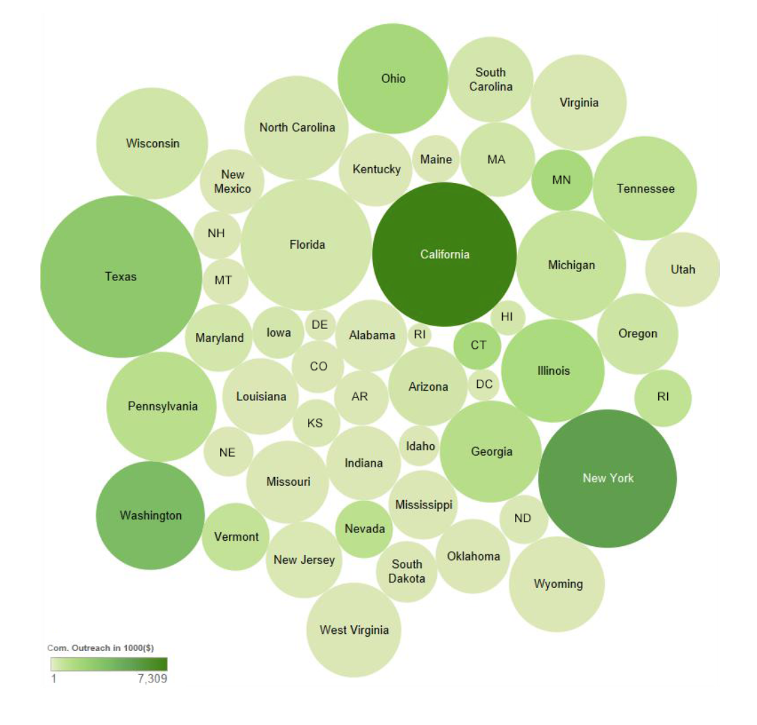
I am trying to visualize the relationship between Supplemental Nutrition Assistance Program (SNAP) (“food stamps”) participation and community outreach by state (data here). I started with a scatterplot, which showed a strong positive correlation between the two variables, but the (potential causal) relationship is more complicated than these two variables (and the visual was not particularly interesting). Instead, I settled on a bubble chart: Color shows averages in thousands of dollars and size shows average monthly SNAP participation (in persons). The visual is a screen shot from my first attempt at using Tableau.
I think the legend could have used a a couple representative sizes to know what the person count some areas represent. Also, the order doesn’t make finding a particular state a user would be interested in easy. You could perhaps have used a Dorling cartogram to as the dot layout so one could utilize their knowledge of the geography of the U.S. to find states easier.
As you have state data and tableau it would make sense to use the filled map option rather than the bubble chart. You could then also have the scatter plot displayed underneath as part of a dashboard with actions linking the two together. Select a state and it would highlight on the scatter plot.
Like this
I think you’re on dangerous ground here. If, as you point out, you don’t want to imply a causal connection between the variables, then you shouldn’t be encoding both variables (one with color and one with shape). It asks the viewer to make the same conclusions as a scatter plot, it’s just more difficult to do so (i.e. I can still see that bigger circles are darker).
I’d also caution against using a map for this data, since you’re not really interested in showing a geographic trend, I think (more on that in this excellent post http://www.ericson.net/content/2011/10/when-maps-shouldnt-be-maps/ )
Really, a bar chart might be your best bet! You could make two separate charts for each variable, or focus on just one.
Thanks for your comments! It wanted to take more of an exploratory approach to the visualization where interpretation is left up to the viewer. We have done many scatter plots & bar charts in the program, so I wanted to do something I have not done before if applicable, which I felt it was. Having said that, I did explore a map, bar chart and a scatter plot diagram prior to settling on the bubble chart. I didn’t feel that the scatter plot told an interesting enough story. Similarly, I didn’t see a benefit in using the map. The bar chart was my next to best bet and it would have been easier to interpret the order of the numeric data and that of the state. Again, I decided to take exploratory, not explanatory approach.
I agree, that it would helped to include the relative size key for the states, and may be some descriptive text.
Finally, it was my first time using tableau, so I realized well into the assignment that I have a lot of learning to do in order to be able to control the visual. There is a lot of supplemental tooltip-like information embedded into the interactive version, but it does gets lost in a static presentation.
I decided to create another version of the graph. Since I don’t have access to Tableau today I didn’t want to simply retrace/rearrange the original bubble graph, so I created a comparative outreach spending vs. participation bar chart in Illustrator. Any input is appreciated:) Thanks very much in advance! Olga
Hello, I think your site might be having browser compatibility issues.
When I look at your website in Opera, it looks fine but
when opening inn Internet Explorer, it has some
overlapping. I just wanted to give you a quick heads up!
Other then that, amazing blog!
Olga,
Your redesign with bar charts is so much better than the bubble charts. It is very hard for a reader to compare size of bubbles and there is no way they would be able to guess the quantitative comparisons accurately. Your bar chart is the perfect visual for this comparison. One small tweak might be to put the state names in between the diverging bars and put the labels on the inside base of the bars so that it creates 2 data tables going down the list, but I think it works very well as is. The other thing you might do is add a choropleth map (just two small ones) with a sequential color scheme for each category in the same color scheme. Then you’d have a quick visual for the states, one for spending and one for participation. Well done.
Jeffrey,
Thank you very much for your comment. I think adding two small choropleth maps for each of the categories is a great idea!..
Olga