MLB Payroll and Wins
I want to create a visualization of the correlation between baseball team wins and payroll between 2002 and 2012. My first idea was to do a slope chart with the different payroll values on 2 parallel vertical axis for the two years. I also wanted to visualize the team standings by percent win and how that changed between the two years, i.e how one team had the highest percent win in 2002 and how that value changed in 2012. Given that I had those two values to try to correlate, I opted for a horizontal bar chart that would enable the viewer compare the change between 2002 and 2012 for all the teams, and at the same time could allow visualizing the correlation between that change and the team performance.
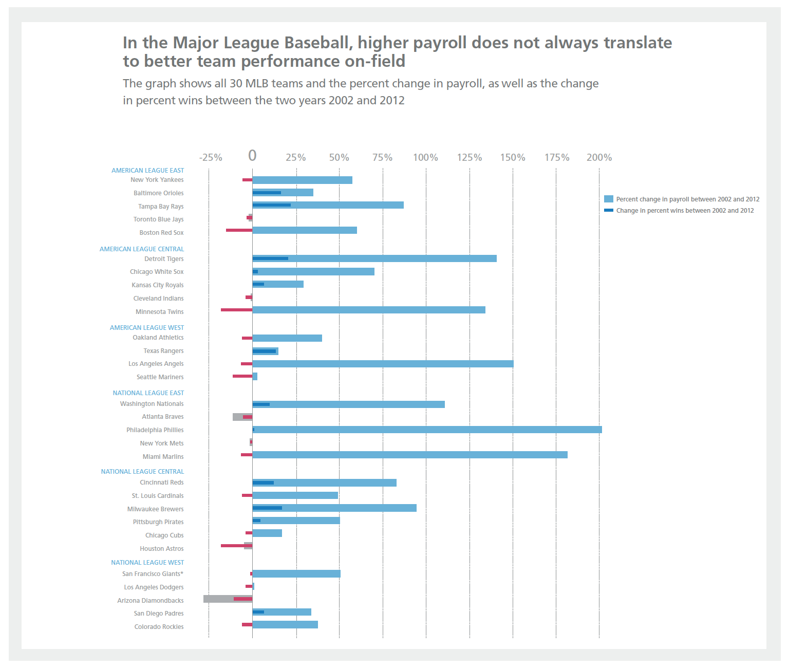
The visualization is a clustered bar chart that shows the correlation between the percent change in payroll and performance between 2002 and 2012. There are two bars on the y-axis: the thick light blue one represents the percent change in payroll between 2002 and 2012, and the thin dark bar represents the change in percent wins between 2002 and 2012. The grey and red bars are for negative values
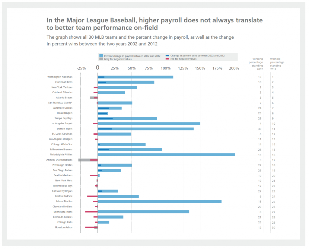
In an iteration to the graph, I rearranged the bars following the winning percentage in the overall League. (Data are here.)
I like this layout a lot to show the data. In some ways I’m glad it’s sorted by division but I think it would have also been interesting to see plotted by most total % change. The gray in the negative is a little dark and maybe you could have made it a lighter/dropped opacity red to mimic the blue encoding. Also the gridlines could be lighter.
This is an interesting idea. But I wonder about the value of comparing just those 2 years: 2002 and 2012. Are there a lot of valid conclusions that could be drawn by comparing those 2 years?
For instance, if I look at the first chart, I see that while the Cardinal’s salary jumped 50%, their performance fell. That might lead me to draw the conclusion that the Cardinals have managed their roster poorly from 2002 to 2012. But of course, that’s not really the case. During those years, they went to the playoffs 7 times and won the world series once, while maintaining a healthy win rate. So while it’s true that their salary increased and their number of wins decreased from ’02 to ’12, they’ve definitely gotten their money’s worth out of their roster.
So I wonder if there’s a different way to show this data. Maybe it would be more effective if the chart could show the 2002 starting points for salary and wins and the 2012 finishing points for salary and wins. In that sense, I think your initial idea for a slope chart may be worth going back to. If you’re working in Excel exclusively, dot plots may work as well (see below). Or maybe you can incorporate more data, including the wins and salaries between 2002 and 2012.
But it’s still very interesting to look at this chart. The distinct story about how dramatically salaries have grown in just 10 years might be interesting to isolate. Thanks for sharing!
Here’s some links you may find interesting / helpful / thought-provoking:
Creating dot plots in Excel: https://www.youtube.com/watch?v=1hP0yDMRxVc
Salary vs. Performance: http://fathom.info/salaryper/
Smartest Spenders in Sports 2014: http://www.businessweek.com/articles/2014-04-24/smartest-spenders-in-sports-2014
I second Andy’s comments. I don’t think you have the right data to answer your question. Maybe show more years or use two averaged periods instead of two single years.
FYI, I did try the idea of looking at 5-year averages. Overall the change still looked insignificant, but if we limit the data to teams whose 5-year winning percent is between 47% and 53% (I figure better or worse teams are too constrained), we can see some possibly real relationship in their differences with the next 5-year period. Here is a plot showing differences over three 5-year periods, so there are potentially two dots per team, one for each pair of 5-year periods.
The regression line unsurprisingly suggests you need a payroll increase ($20M over 5 years) to keep the same win percentage.
I really enjoy the use of color and layering to represent the negative and positive. In my initial review, I thought it was great how you organized the data. I can see the regional and league differences, but I started to ask what other stories could be told. Like Kevin, I wonder what about the most and least total change. What about using a map to depict league differences? If you could make this interactive, how would you tell the story then?
I like the balance, clarity and the visual aesthetics of this graph. The description makes a good introduction of the content. I don’t know anything about baseball — still it makes me want to look at and examine the data… Unfortunately I can’t zoom in, so guess about the content in the finer print (I know the graph is designed to be viewed at a larger size though). It took me a bit understand that the grey and light blue are the same variable, just as blue and hot pink are the same variable, just positive or negative. The grey does seem as a good negative version of the light blue, but it’s harder for me to view the magenta as a negative of a blue, especially since the dark and light blue somewhat bland together. I do understand that having the teams grouped by division makes organizational sense. However, since the most prominent color (magenta) is used to illustrate a negative change in percentage of wins, I assume is intended to be the prime focus of the graph; thus, perhaps it could be arranged in descending or ascending order in order for the viewer to read the story by following the change in this value against the change in in payroll? Just and observation, that this hierarchy would be a non-issue in a dynamic presentation graph with the ability to “sort by…”, etc..